Opera's Neon Browser Is Futuristic But Far Too Busy
Sign up to receive The Snapshot, a free special dispatch from Laptop Mag, in your inbox.
You are now subscribed
Your newsletter sign-up was successful
Opera released a new concept web browser called Neon, and its supposed to serve as the company's vision for the future. Neon is designed for media consumption, but I found the majority of its features to be distracting when compared to today's browsers.
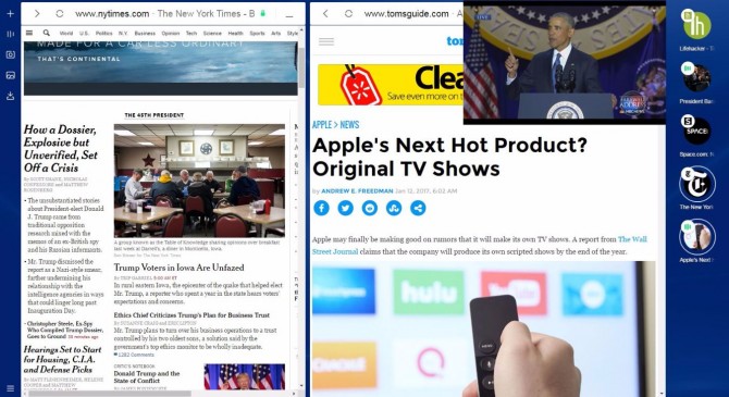
The biggest change is that the options are all featured in sidebars. On the left is a bar with a video player, download manager, screenshot clipper and image viewer, while the right sidebar holds all of your tabs. The new homepage is a set of pre-populated sites that the browser thinks you'll like.
MORE: Opera Browser Adds Free, Unlimited VPN Feature
Article continues belowI think a lot of the features are really cool, but the whole experience is really busy and distracting. The sidebars shrink the amount of real estate you have to read websites. And while I was able to fit a lot on screen -- I scanned the front page on the New York Times, read an article on Tom's Guide and watched a popped-out video of President Barack Obama's farewell speech simultaneously -- there was so much going on that I couldn't focus on any one part of the screen. Perhaps the key is restraint. Using splitscreen and pop-out video at once is a lot.
The browser also has an algorithm that floats tabs it thinks you want to the top, which might peeve tab hoarders who know exactly where they left everything.
You can download the concept browser for Windows, which isn't replacing regular Opera anytime soon, here.
Windows 10 Basics
- 7 Settings to Change Right Away
- Windows 10 Keyboard Shortcuts to Save You Clicks
- 5 Ways to Take Screenshots
- Change Your Password in Windows 10
- Uninstall Programs in Windows 10
- Enable or Disable Tablet Mode
- Add a User (Child or Adult)
- Change the Screen Resolution
- Sync Your Settings Across Devices
- Sync iPhone with Windows 10
- Control Windows 10 with Your Voice
- Upgrade to Windows 10 From Windows 7 or 8
- Eliminate Blue Light With Night Light
- Create a New Folder
- Get to the Desktop in Windows 10
- Add a Printer
- All Windows 10 Tips
- Set Alarms
Sign up to receive The Snapshot, a free special dispatch from Laptop Mag, in your inbox.
Andrew is a contributing writer at Laptop Mag. His main focus lies in helpful how-to guides and laptop reviews, including Asus, Microsoft Surface, Samsung Chromebook, and Dell. He has also dabbled in peripherals, including webcams and docking stations. His work has also appeared in Tom's Hardware, Tom's Guide, PCMag, Kotaku, and Complex. He fondly remembers his first computer: a Gateway that still lives in a spare room in his parents' home, albeit without an internet connection. When he’s not writing about tech, you can find him playing video games, checking social media and waiting for the next Marvel movie.

