Laptop Mag Verdict
Apple's word processor, spreadsheet maker, and presentation app for the iPad are easy to use, and they make your documents look good.
Pros
- +
Mostly intuitive interface
- +
Convenient ability to preview files
- +
Lets users work on presentations
- +
Can add fun animated transitions to presentations
- +
Option to export files as Microsoft Office documents and PDFs
Cons
- -
Can't import Google Docs
- -
Must download (and pay for) each app separately
- -
Relatively large installation files
Why you can trust Laptop Mag
While television commercials for the iPad highlight all the fun you can have with it--watching HD movies, reading books, and playing games--Apple reminds us you can also use it to get work done. That's why it created Keynote, Numbers, and Pages for iPad ($9.99 each), a triumvirate of productivity programs. These apps, which mirror the iWork suite Apple created for the desktop, are almost as easy to use and are feature-rich, especially given that the iPad doesn't even have a physical keyboard.
Getting Started
Compared to other productivity apps, Apple's seem on the expensive side. Each one (Keynote, Numbers, and Pages) costs $9.99, which is pricey when you consider that Quickoffice Connect Mobile Suite for iPad gives users the functionality of both Numbers and Pages for the cost of one. Apple's apps also take up a relatively large amount of space (Keynote requires 53MB; Numbers, 43MB; Pages, 42MB). Quickoffice's offering, meanwhile, takes up just 15MB.
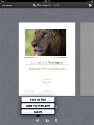
When you launch any of these apps, you'll see a window showing the first page of the last document you opened. If there are multiple documents, you can swipe through them as you would windows in mobile Safari. Being able to preview a document before loading it is convenient (competitors, such as Quickoffice, just display a list of files by name). From the home screen, you can also delete, duplicate, or export a file to iWork.com, Apple's answer to Google Docs, or send it as an e-mail attachment. Regardless of whether you're working on a word document, spreadsheet, or presentation, when you create a new document you can choose a blank one, as well as one of 15 templates, such as an expense report or resume.
Annoyingly, you can't import files you created using Google Docs, even if you've synced a Gmail or Google Apps account to the iPad. Instead, you can add files to your library in one of three ways: using Apple's iDisk app (this really only applies to MobileMe users), opening e-mail attachments, or importing from iWork.com.
At any time, you can press My Documents (or, say, My Spreadsheets) to return to the home screen, where you see all of your files as preview windows. However, it's annoying that even if you were just in the document you have to wait for it to reload once you retap it (despite the iPad's usually impressive speeds, this can take a couple seconds). Oddly, you have to return to that home screen if you want to rename a document; you can't complete this action while the app is open. One other design suggestion: we wish there were a dedicated Save button, or at least some visual indication that the app had automatically saved our work. In fact, iWork does save every change you make, as well as the previous 200, allowing you to redo or undo a long series of edits.
Click to enlarge
Sign up to receive The Snapshot, a free special dispatch from Laptop Mag, in your inbox.
Pages
As with Keynote and Numbers, you have to double-tap the page to make the on-screen keyboard appear. Drag your finger along the right-hand side to see previews of the pages to come; when you reach the page you want, lift your finger from the screen and the program will skip to it. In the case of Pages, double-tapping also brings up a ruler at the top of the screen, along with buttons for applying bold, underlines, and italics to words, and changing the alignment of the text. There's also a dedicated Undo button. By pressing one of three icons in the upper right corner, you can check spelling, add bullets, numbers, or columns, and incorporate photos, tables, and charts (there are often tabs within these settings menus that house myriad editing options).
Getting work done was pretty painless. We were able to type at a relatively fast clip using the on-screen keyboard (the trick is mastering the two-fingered pecking technique). The spelling correction is so intelligent that we rarely had to hit the Backspace button to re-enter text. In fact, we composed the first draft of this review using Pages for iPad. However, selecting specific blocks of text can be difficult, which makes copying, cutting, and applying bullets to a series of paragraphs tedious, even though choosing the bullets themselves from a menu is easy. Tip: use two fingers to zoom in before attempting to select text. It'll make highlighting easier.
Adding photos to word documents is also easy. By default, the app will automatically wrap the text around an image (you can also have it appear just below and above it). As you drag the photo around the page, the text will automatically re-wrap itself, even if you've already partitioned the text into columns or added page breaks.
Sending a document as an attachment was as easy as pressing the Export icon on the home screen. At this time, you can choose to send it as a Microsoft Word Document (DOC), Pages document, or PDF. When you press the Send button in the iPad's Mail application, the app makes a satisfying "whoosh" sound to indicate it was sent.
Numbers
The home screen for Numbers follows the same format as Pages. It too has 15 templates choices, besides a blank spreadsheet. The app supports tabbed spreadsheets, and you can rename these tabs while you're working on them (renaming tabs is easy, but you still have to close out of the spreadsheet to rename the document itself).
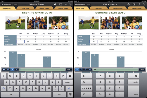
Numbers also follows the same design aesthetic as Pages--namely, that you have to double-tap to activate many of the more advanced formatting options. The on-screen keyboard is home not just to a QWERTY layout, but to a number pad, formulas menu, and text formatting options. There are small icons (too tiny even for our fingers) that let you choose between menus for text, formulas, numbers, and controlling how dates and times appear. If that all sounds intimidating, rest assured that the app is smart enough to choose the right keyboard based on context; if you type in a text column, for example, the QWERTY keyboard will appear. Still, it would be nice if Apple had made a few common features accessible with a single tap, as it did with basic text formatting tools in Pages.
Click to enlarge
We got the hang of this feature-filled keyboard quickly, and were able to compose a spreadsheet, in which we tracked the number of miles we had run each day for marathon training, without confusion. In fact, Apple included some neat time-savers. For example, under the formula section is a dedicated Sum button, which makes it easy to calculate the total for a column. (Just remember to tap the green check mark to indicate you're done; otherwise, Numbers will think that the next cell you tap should be included in the Sum equation.) Similarly, if you're inserting dates, Apple makes it so that you don't have to peck in any numbers or letters; all you do is tap Month and then one of 12 buttons. Then you can tap Day and type the number(s) in.
As with Pages and Keynote, Apple lets you add some visual pizzazz to your spreadsheets. For instance, when you insert a pie chart, you can remove a wedge to emphasize a statistic. You can also turn a tab within a spreadsheet into a different form entirely, such as a checklist, whose data is linked to a more straightforward table in another tab.
Keynote
Perhaps in a nod to today's widescreen projectors and displays, you can only use Keynote in landscape mode. Although its feature list pales in comparison to what you'll find on the desktop version of Keynote, this app left us practically giddy with excitement (that's saying a lot, given that we're talking about creating presentations).
Click to enlarge
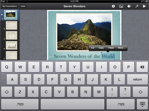
The look of the app just makes sense: there's a thin pane on the left-hand side, showing all of the slides in the deck; the slide you're working on takes up most of the screen. You can slide your finger up and down this panel to review all of the slides, as well as hold and drag slides to rearrange them (you can move several at once, too). There's a Play button in the top right corner, along with icons that allow you to add photos and tables. At any time, you can double-tap to exit slideshow mode and resume editing.
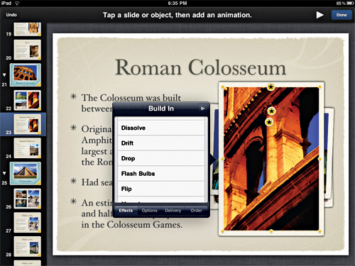
What we love most about Keynote is that it's easy to add compelling animated transitions (pictured below), just as in the desktop app. For instance, we made a graphic appear by drifting on-screen from the left, and then disappear amid a flash of bulbs. Other additions include Apple's Magic Move, which animates objects that appear on consecutive slides.
Click to enlarge
Sure, on the desktop side you can customize everything--the color of the bars in a graph, and their texture--but we're glad that Apple made its iPad app just as easy to use. Just double-tap an object, and select either Build In (an object on its way into the slide) and/or Build Out (on its way out). You can even customize how many seconds each of these transitions take.
Verdict
Apple's iWork suite, which includes Keynote, Numbers, and Pages for iPad ($9.99 each), has the most dazzling interface of any office suite for the iPad, as well as the richest feature set (animated Keynote transitions are just one of our favorites). If you don't have any use for presentation software, Quickoffice for iPad--which costs $9.99 for a word processor and a spreadsheet app--represents a better bargain. We wish it could seamlessly sync with Google Docs, or any cloud-based service other than MobileMe and iWork.com, but Apple's iWork suite is the true triple threat.
Apple iWork for iPad Specs
| Company Website | http://www.apple.com |
| Platforms | iPad |
Dana Wollman was a contributing writer at Laptop Mag. Her coverage included reviews of some of the most iconic laptops from the previous decade, such as the Dell XPS, Dell Studio, HP EliteBook, and MSI Wind. She focused on smaller netbooks and productivity-oriented devices. After Laptop Mag, Dana worked as an Editor-in-Chief at Engadget, and is now a Senior Technology Editor at Bloomberg.
