Laptop Mag Verdict
Apple's iOS 7 software offers a sleek modern design, easier settings access, and better multitasking, but it still trails Android in some areas.
Pros
- +
Cleaner, more modern look
- +
Improved multitasking
- +
Control Center provides easy access to settings
- +
Smart photo organization
Cons
- -
Icons don't update or change with info
- -
Still lacks customization of Android phones
- -
Some redesigned icons are confusing
- -
No actionable notifications
Why you can trust Laptop Mag
Colorful, stark and tres minimaliste, Apple's iOS 7 represents an extreme makeover for a mobile platform that has sported the same look since President George Bush was in office and Hannah Montana was in season one. That was 2007, when Steve Jobs introduced the world to the original iPhone. Over the years Apple has added many features to its software, but the overall aesthetic and navigation has largely remained the same. That all changes with iOS 7, which boasts an all-new design and welcome new features such as Control Center and improved multitasking. Has Apple gone far enough to narrow the user experience gap with Android, or has it gone too far?
Editor's Note: We tested a developer preview build of iOS 7 (GM Seed 11A465) for our review.
[sc:video id="VqN3E1cTrJ_uTOGivmtTxgP5iMo1ewVj" width="575" height="398"]
MORE: iPhone 5s: Full Review
Device Support
iOS7 will be compatible with the iPhone 4 and later, iPad 2nd generation and later, iPad mini, and the 5th generation iPod touch, and is free to download.
However, some features will only work on more recent iOS devices. The iPhone 4S won't have camera filters or AirDrop; the iPhone 4 and the third-generation iPad won't have camera filters, AirDrop, or Siri; and the iPad 2 will not have camera filters, panoramic photos, square photos and videos, or Siri.
Sign up to receive The Snapshot, a free special dispatch from Laptop Mag, in your inbox.
Interface
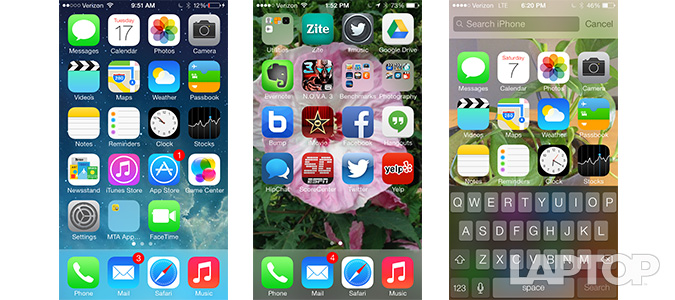
Much has been said about iOS 7's "flatter" interface, but overall, it's a welcome refresh that makes everything feel cleaner and less cluttered than iOS 6. It's like going from your aunt's house cluttered with Hummel figurines to MoMA.
Icons are much more minimalist. Take, for example, the Camera icon. Instead of a detailed image of a camera lens, the icon is now a dark gray camera with a few white lines. Skeuomorphic cues, such as the leather background of the Calendar, wood grain of the Newsstand, and paperlike Reminders have all been replaced with white, slightly textured backgrounds.
Other icons, such as the App Store, Messages, Music, and iTunes, have all lost the star burst and reflective backgrounds in favor of simpler, but brighter, colors. Subtle differences abound; tiles are no longer shaded, and folders no longer have a gray border. The text beneath the tiles is also thinner, and instead of permanent shading, as on iOS6, only appears when you have a lighter colored background. If you choose an all-white background, the text turns black -- a nice touch -- but the Calendar, Photos and Game Center tiles, which also have white backgrounds, lose the square edges.
MORE: iOS 7 Essential Tips and Tricks
In going for simplicity, though, some of the icons have become more inscrutable. The Safari icon now lacks the North, South, East and West markings, but it's still a compass -- which makes little sense. Game Center has gone from game icons to a cluster of bubbles.
Click to EnlargeWe do like the translucent window overlays. In iOS 6, if you were to open a menu, keyboard or folder, its background would consist of dark grays and blacks. In iOS 7, the background turns milky, but lets the colors of whatever's in the background -- an image, Web page, etc. -- bleed through.
Animations are also different. When you first open the Home screen, the icons fly in from above, rather than the sides. When you open or close an app, it expands or contracts from the location of the tile itself, instead of the center of the screen. The icons all fly in at different times, which looks cool, but takes a split second longer than iOS 6.
One of the fun new aspects of iOS 7 is its parallax feature, which shifts the tiles relative to the background image as you tilt the phone. It'll have you twisting the phone for the first 10 minutes just to see what it looks like.
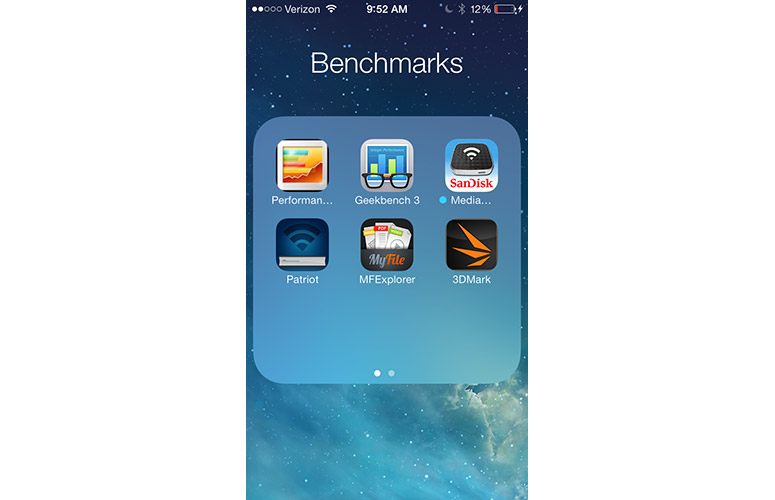
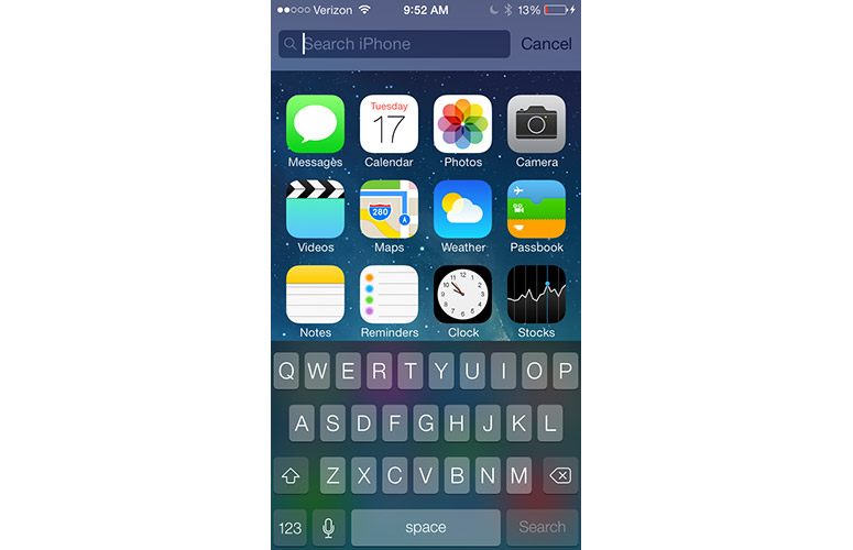
Click to EnlargeInstead of swiping all the way to the left to open Spotlight, simply drag down from the middle of any screen to search your iOS device. It's a much more practical alternative, especially if you've loaded your iPhone with pages of apps. Another small improvement is the ability to add additional pages, and thus, more than 12 apps to a folder.
For all the aesthetic changes, though, we wish that tiles in iOS 7 had an interactive element, as with Windows Phone 8, which shows you updated information about contacts and email, for example. And, unlike Android, iOS 7 doesn't support widgets.
Sharing
Sharing options are still limited when compared to Android. In multiple apps, such as Safari and Maps, you can share content via Message, Mail, Twitter, Facebook and, in the case of Photos, to Flickr, but that's it.
There's no way to share to LinkedIn, Google+, or any other apps within iOS 7's sharing menu.
MORE: iPhone 6 Features: What We Want From Apple
Multitasking
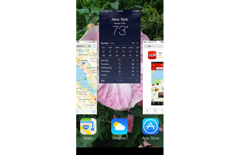
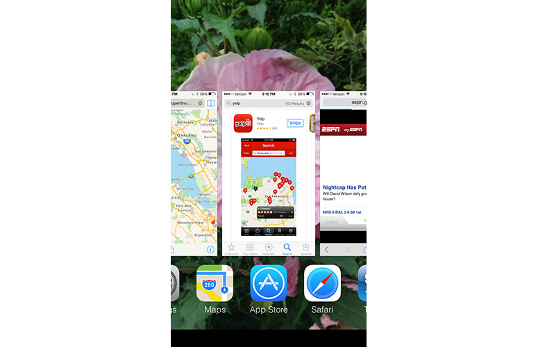
Click to EnlargeDouble-clicking the Home button in iOS 7 reveals a new way to see all the apps you currently have open. Instead of just showing the tiles along the bottom, a new multitasking view now shows large thumbnails of each open app in the middle of the screen. While it apes the look of webOS, we like that you can now see what's open in each app. And, unlike WP8, you can simply flick a thumbnail up to close the app.
However, others take multitasking further. Samsung's TouchWiz interface, for example, lets you run two apps side by side, and both LG and Samsung let you open an app in a floating window. While this is less of a drawback on the iPhone's smaller screen, we could see this type of functionality being very useful on an iPad.
Control Center
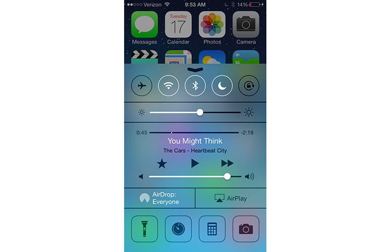
Click to EnlargeIt's about time that iOS had access to quick controls like this. Swipe up from the bottom of the screen, and the Control Center appears, which provides access to several core functions.
At the top of Control Center are buttons to activate Airplane, Wi-Fi, Bluetooth, Do Not Disturb and Rotation lock. Beneath these is a slider for screen brightness; below that is audio control (as well as a thumbnail of what music is playing).
An Airdrop icon comes after, and at the bottom are icons for the Flashlight, Timer, Calculator and Camera apps. We're sure that more than a few developers will be miffed that Apple has created its own Flashlight app.
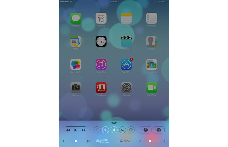
Click to EnlargeSmartly, Control Center takes up a miniiPad minit of room on larger devices, such as the iPad mini. Instead of five rows of controls, as on the iPhone, there are only two. However, both Flashlight and Calculator are absent.
Although it's not as extensive as Samsung's TouchWiz menu, Apple hit all the important notes with Control Center. However, we'd like to be able to customize the buttons at the bottom, so that we could quick-launch apps of our choosing.
Notifications
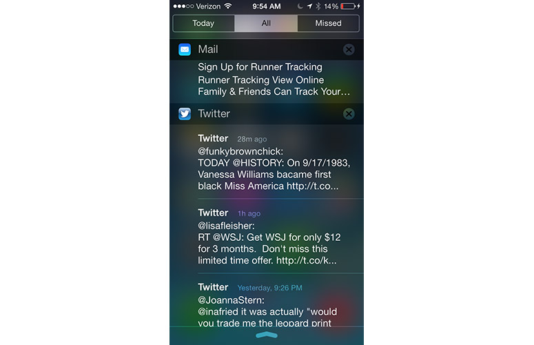
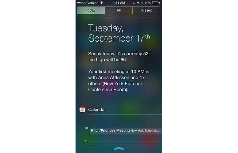
Click to EnlargeAs in iOS 6, pulling down from the top of the screen reveals notifications; but unlike iOS6, you can view these from the lock screen.
Gone are the two buttons that let you send Facebook or Twitter messages. The current weather is also more minimalist; the little icon that shows whether it's cloudy or sunny is gone in favor of just text.
Below the date and weather are calendar listings for the day, stock quotes (if enabled), and calendar events for the next day. Somewhat maddeningly, it says "There are 4 events scheduled, and the first one starts at 10 AM," but you can't press this notification to actually view the events.
Click to EnlargeAt the very top of the screen are tabs for Today, All and Missed. All will show Tweets and Facebook messages. If you've opened notifications from the lock screen, you can only view these messages; if, however, you open Notifications from the Home screen, you can respond to these alerts (the corresponding app will open). Having both All and Missed seems redundant. Wouldn't any missed notifications be in the All category, too?
While we miss the little cloud and sun icons from iOS 6, the new Notifications drawer makes it easier to view information at a glance. We also like its translucent background, which feels more sophisticated than the gray cross-hatched background of iOS 6.
Still, the revamped Notification Center feels behind Android, as well as OS X Mavericks. For instance, if you select an email from the Notifications tab, it will open the Mail app. Why not an option to respond right from Notifications as you can from OS X Mavericks alerts? Similarly, you can't add calendar events, or message those going to the same event to say you're running late, which Android offers.
In Android, if you receive a text message, you can reply or call the person back right in the notification drawer. While you can read texts in iOS 7's notification drawer, pressing on the text itself opens the messaging app.
Lock Screen
Click to EnlargeAs with iOS 6, swiping to the right on the lock screen lets you unlock the phone, and a little camera icon in the lower right lets you open the Camera app. However, swiping up from the bottom of the screen now reveals the Control Center, and swiping down from the top of the screen shows notifications (if you have this enabled).
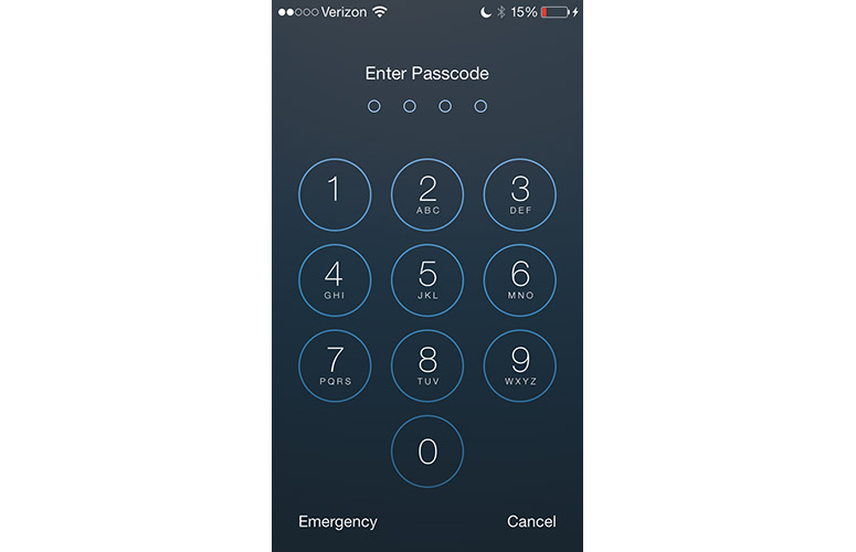
The numbers on the Passcode screen are much larger, taking up a majority of the screen, and are in big circles, rather than in a square grid.
We still find iOS 7's lock screen too limited. On most premium Android phones, you can unlock to any app you want right from the home screen, which saves users time.
MORE: How Secure is the New iPhone's Fingerprint Security?
Siri
Click to EnlargeSay hello to Bing, Siri. In one of the most telling signs of shifting corporate allegiances, Apple ditched Google for Microsoft's Bing as the default search engine when you ask Siri a question.
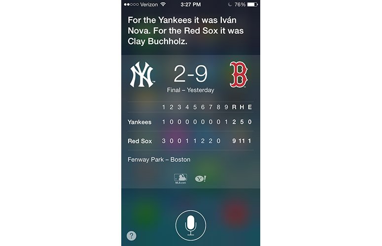
When we asked Siri "What was the score of the Yankees game," both iOS 6 and iOS 7 Siris (which drew their info from MLB.com and Yahoo) responded accurately. When we followed this up with "Who pitched," both Siris answered correctly.
You can get around Bing by saying "Search Google for...", but results will be opened in Safari, rather than in Siri's interface.
While there's still a microphone icon at the bottom, once you start speaking, it turns into a sine wave that reacts to your voice, a nice animation that lets you know you're being heard. Siri's female voice now sounds more natural and smoother than iOS 6; a male voice is now available, although it sounded slightly choppy in the developer preview we tested.
In addition to everything you could search for previously, you can now have Siri search Twitter for a particular user or subject. This feature worked well. "What's Joanna saying on Twitter" showed the 10 most recent tweets from our friend Joanna, and asking "who's tweeting about Miley Cyrus" brought up a number of tweets regarding the singer.
Click to EnlargeAnother new feature of Siri is that you can now use it to change settings, such as turn on Airplane Mode, Wi-Fi or Bluetooth, even dim the screen. These features worked well.
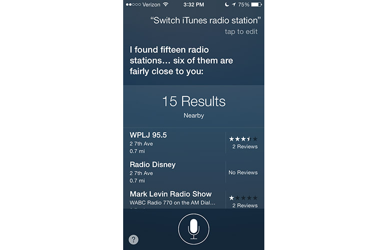
Siri can also be used to control iTunes music and radio. Commands such as "Play iTunes radio" and "Pause track'" worked quickly. You can also switch stations, but you have to be specific about which station you want to switch. The generic "Switch to a different station" didn't work, but "Play Bruce Springsteen station" changed channels.
AirDrop
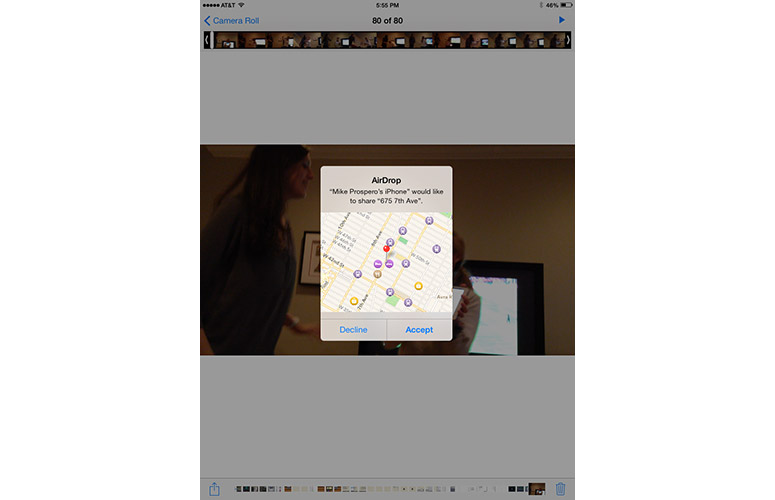
Click to EnlargeOne of the features touted in numerous Samsung smartphone ads is the ability to bump two phones together to wirelessly transfer photos and other files. With iOS 7, Apple has responded, adapting the AirDrop feature it introduced in OS X to its handheld platform. As with OS X, AirDrop uses Wi-Fi and Bluetooth to create a temporary connection between two devices in order to transfer files.
Within Control Center, you can activate AirDrop, and make your device visible to everyone, or only your contacts.
After, select the item you wish to share (which can include a photo, video, app or music info, or map location) and press the Share button (the square with an arrow pointing out the top). In the window that appears, any AirDrop-enabled devices in range will appear as small circular icons. Select the one you want, and an alert will appear on that person's device. Once they press "accept," the file will transfer.
Click to EnlargeWe were able to send photos from our iPhone to an iPad mini in less than a second. A 1:56 1080p video took about 1 minute and 30 seconds to transfer, which is fairly quick.
It's too bad you can't send files from your iPhone to your Mac. As of this writing, you can only share content, such as photos, between iOS devices, or between OS X notebooks. Also, AirDrop will only be available for the iPhone 5 and later, iPad 4th generation, iPad mini and iPod touch 5th generation.
MORE: iPhone 5S: Why We Love (and Hate) Apple Products
Keyboard
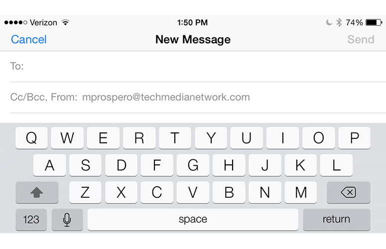
Click to EnlargeWhat, no swiping? At a time when seemingly every other smartphone (except Windows Phones) have a Swype-style keyboard, the keyboard in iOS 7 remains little changed from previous versions. The layout of the keys, as well as their spacing and size, is unchanged. The only difference is that the lettering -- as with the rest of iOS 7 -- is thinner, and the background is a light translucent gray, rather than a dark gray. When there's a dark image in the background, the lettering turns white, and the keys become a darker gray.
While the typing experience on iOS 7 is quite good, Android keyboards offer better features, from next-word prediction to dedicated number rows. Also missing from iOS 7 is offline voice typing; dictating on Android phones is still considerably faster.
Camera
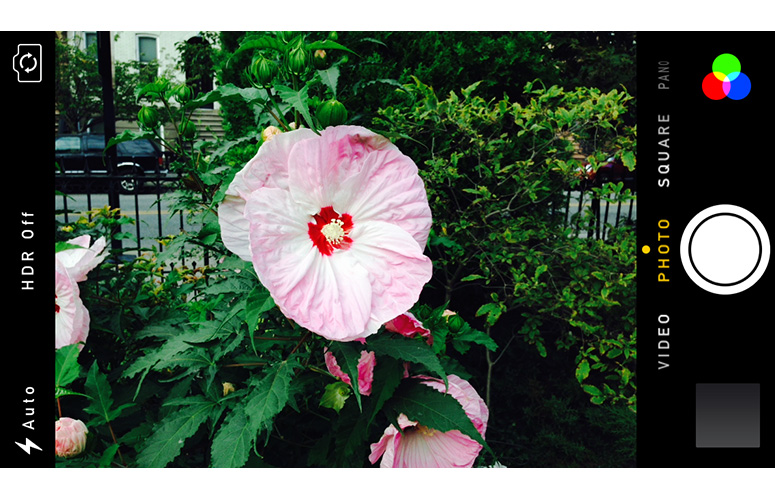
Click to EnlargeThe updated Camera app in iOS 7 not only has a slicker look, but also lets you do more with photos. When held in portrait mode, the top of the screen has options for the flash, HDR, and to switch from the rear to the front camera.
Just below the center portion of the screen are options for switching between shooting modes: Photo, Pano, Square and Video. Photo, Pano and Video are the same as on iOS 6, but the new square mode, as its name suggests, changes the aspect ratio from a rectangle to a square. This latter feature makes photos more Instagram-friendly, but nothing beyond that.
To switch between modes, just swipe the main section of the screen to the right or left. The screen will blur for a second as it changes modes.
At the bottom of the screen is a large circular shutter button in the middle, a square Photos icon on the left, and an icon made of three small circles on the right. In Video mode, the shutter button turns red, and a timer appears at the top of the screen.
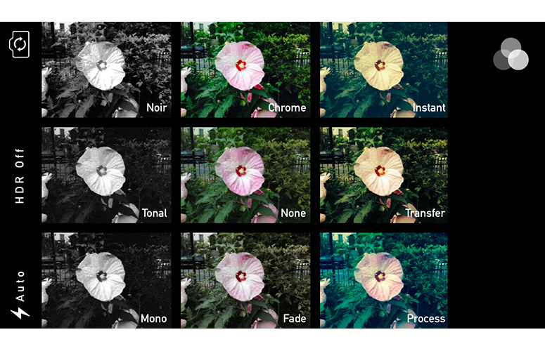
Click to EnlargePressing the three-circle icon opens a new window with eight filters, each presented in a small square with the current camera view. After selecting a filter, you're returned to the main screen, and the filter icon will turn from gray to red, green and blue. While not as comprehensive as other photo apps, it's a nice addition, and definitely a nod to the retro-style filters found in Instagram.
Holding the shutter button down activates Burst mode, which will fire off up to 10 shots per second; a small counter appears above the shutter button, letting you know how many photos you've taken. To review these shots, press the square button in the lower left; the app will present what it thinks is the best shot from the entire sequence. However, by dragging your finger to the left of right, you can view all the images as well.
MORE: Smartphone Camera Shootout 2013
Photos
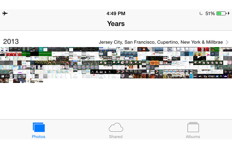
Borrowing a page from photo organization apps such as Flavyr, the Photos app in iOS 7 organizes your images based on time and location. At its most zoomed-out, Photos sorts all the pictures you took by year; each is a tiny thumbnail, and the presentation looks somewhat artistic in this view.
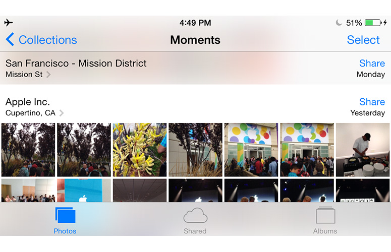
Click to EnlargePress on any part of this collage, and the screen changes to the Collections view. Here, photos are divided into smaller chunks of time, and the dates and location of where the images were taken appear at the top of each group. The thumbnails are also slightly larger in this view. If you press on the location info, Photos will switch to a map view, showing where the pictures were taken.
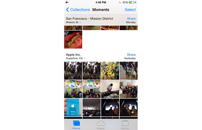
In Collections, pressing the cluster of photos opens the Moments view, which sorts images by date. As with the Collections view, pressing on the location header at the top of each Moment will open the map view.
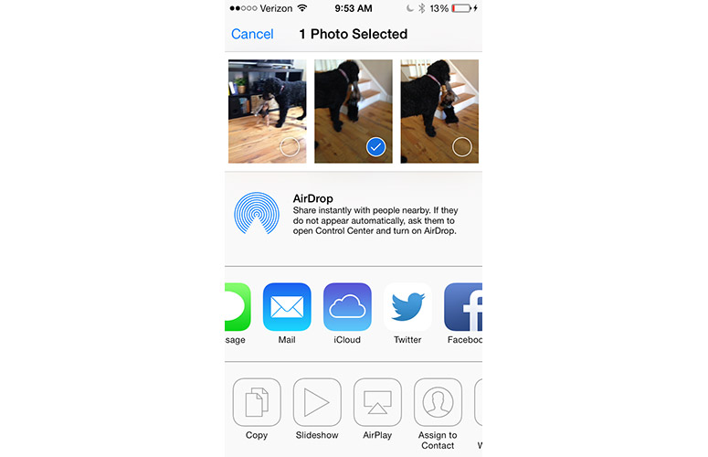
Click to EnlargePress the Share button at the top of each group, and a menu appears giving you the option of sharing all or some of the photos within a Moment. If you choose "Share This Moment," you can only share it via instant message, iCloud or AirDrop. The "Share Some Photos" option lets you share photos via email, Twitter, Facebook and Flickr.
Curiously, you can't use the Share button to share a photo via AirPlay; for that, you have to select a photo first, then press the Share button in the lower right corner.
At the bottom of the Photo app are three options: Photos, Shared and Albums. The latter shows you how many photos are in your Camera Roll, Photo Stream, Videos and Movies. Shared lets you share, and view shared photos with others using iCloud.
Those who take hundreds, if not thousands, of photos on their iPhone, will appreciate the new organization methods of Photos. It makes it much easier to search for an individual image throughout your entire collection. In the future, we'd also like to see face tagging, a feature on Facebook that also makes it easy to search for particular images.
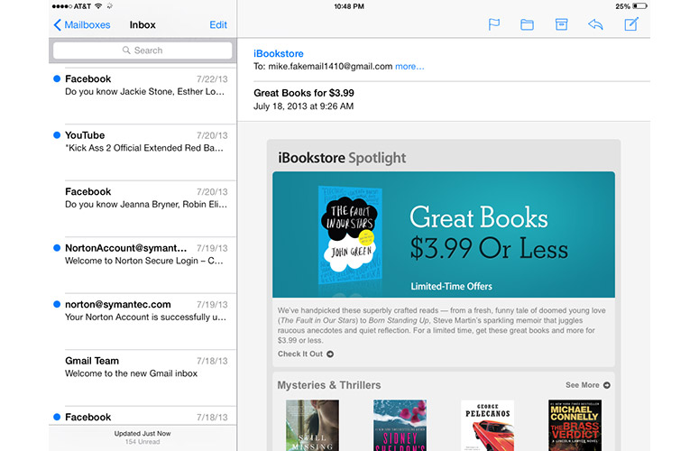
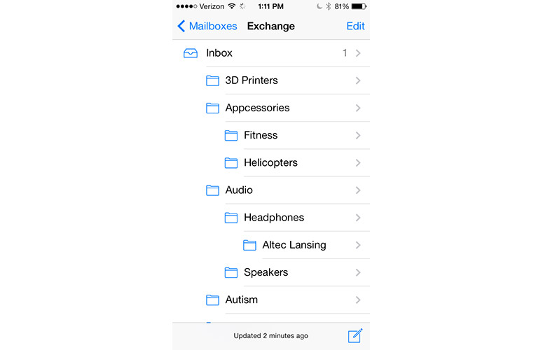
Click to EnlargeThe Mail app in iOS 7 is largely structured as before, albeit with a much starker look. The main Mailbox shows your various accounts, as well as the number of unread emails in each. As with iOS 6, if you designate certain contacts as VIPs, their correspondence will appear in a VIP mailbox.
Press the Edit button in the upper right, and you're presented with some new options. Now, instead of just being able to reorganize the order of the mailboxes, you can show mailboxes based on different criteria. For example, you can have a mailbox of all flagged email, one showing just unread email, or one showing all email with attachments.
Click to EnlargeThe biggest change in the Mail app comes when you want to delete an email. Instead of swiping to the right -- which does nothing -- you now must swipe to the left. This reveals two options: More and Archive (or Trash). Selecting More brings up options to Reply, Forward, Flag, Mark as Unread, Move to Junk or move the message to a folder. An Edit button in the upper right corner lets you select multiple emails at once.
As before, at the bottom of individual emails are icons to flag, move, archive, reply and write a new email. However, as with Safari, the icons are now blue on white, rather than white on blue.
MORE: 40 Best Free Apps for iPhone
Safari
Click to EnlargeThe more minimalist look of Safari makes much better use of the iPhone's smaller screen. At the top of the display, the two bars -- one for URLs, one for search -- has been replaced with a single bar, which you can use to enter either a search term or a URL. It makes a lot more sense, and is a more economical use of space. Google is used as the default search engine.
The menu bar at the bottom has the same controls as before (forward, back, share, bookmarks and tabs), but the icons are now blue outlines on a light gray background, instead of filled-in white icons on a blue background. The interface feels a lot airier.
When you start scrolling down a Web page, the bottom bar disappears, and the top bar is minimized, another smart use of available real estate.
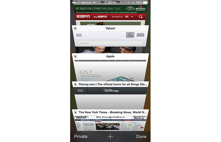
Click to EnlargePress the Tabs button, and you'll see perhaps the biggest change to Safari. Instead of showing tabs as smaller thumbnails side by side, tabs are now overlapped in a style that's reminiscent of CoverFlow in iTunes and OSX. Drag your finger, and you can scroll through the tabs, and close any by pressing the X at the upper left corner of each tab.
This new tabbed look only appeared in the iPhone version of iOS 7. On the iPad mini, Safari still had a more traditional tab interface.
At the bottom of the Tabs view is a button to enter Private mode -- Safari won't track your history or cookies. When you enter or leave Private mode, Safari asks if you want to close your existing pages, or keep them open. We wish it were a little more obvious when Private mode was activated. The only indication is that the menu bars change to a dark gray from a light gray.
The Bookmarks menu has been cleaned up a bit. At the top are three tabs: Bookmarks, Reading List and Shared Links. In iOS 6, the Reading List was merely the topmost Bookmark; separating this feature into its own category feels more natural.
Click to EnlargeShared Links brings an innovative social component to Safari. Provided you have a Twitter account, any tweets that contain URLs will appear in Shared Links. Yes, it's more likely that you'll open these links from Twitter itself, but it's a nice option to have in Safari, too.
Pressing the Share button brings up similar menu options as in iOS 6, the biggest difference being the AirDrop sharing option at the top. Below that are options to share a Web page via instant message, email, Twitter and Facebook. At the bottom are options to bookmark a page, add it to your reading list, home screen, copy and print.
Music and iTunes Radio
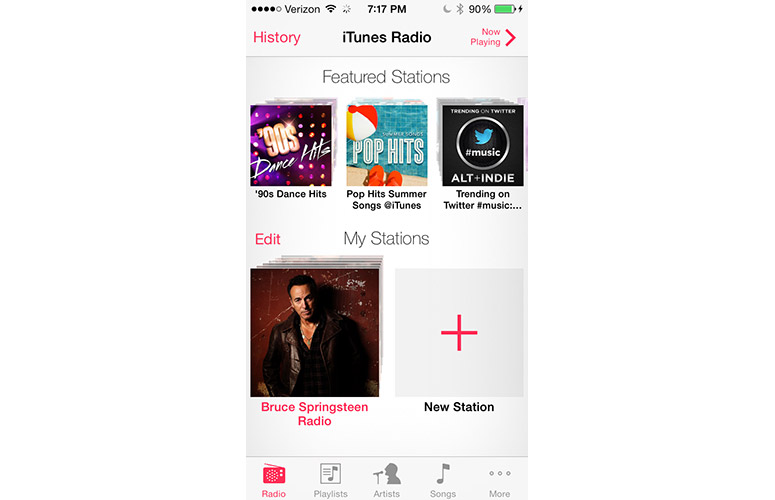
Click to EnlargeThe newest, and most potentially disruptive, new feature of the Music app in iOS 7 is iTunes Radio. This service lets you stream music much like Pandora or Slacker, and is free with ads, and ad-free for iTunes Match subscribers.
Press the little radio icon (skeuomorphism lives!) in the lower left corner of the Music app, and the screen shows a horizontally scrolling list of features stations at the top, and My Stations beneath. Press the Plus sign to create a new station, and you can choose from a number of preselected genres, or type in a genre, artist or song in the search bar at the top.
Click to EnlargeSelect a station, and the screen changes to show the song currently playing; album art fills the top two-thirds of the screen, with the title and album name beneath. Below that is a pause/play button and a button to skip tracks. Like other free streaming music services, you can only skip six songs per hour. To the left is a Star button; pressing this brings up three more options: Play More Like This, Never Play This Song and Add to iTunes Wish List.
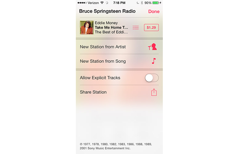
Press the Info button at the top of the screen, and a drop-down window appears with options to create a new station based on the artist or song currently playing, Allow Explicit Tracks, and Share the current station. Above these options is a button to purchase the song currently playing from iTunes, or other songs from that artist.
iTunes Radio feels like a natural extension of iTunes, and was easy to use. However, like some other features in iOS 7, it feels as if Apple is borrowing an idea from other companies.
MORE: Best Smartphones 2013
Maps
Click to EnlargeYes, Apple's Maps app was fixed in iOS 6 -- 3D structures, such as the Brooklyn Bridge, no longer look like M.C. Escher paintings -- so most of Apple's tweaks to the Maps app in iOS 7 are cosmetic.
When you first open Maps, you're shown an overhead view of your current location. While the top of the display is the same, with a button to plan a route, search bar and bookmarks, the bottom controls are slightly different. Now, a white translucent bar runs the length of the bottom, with options to center yourself, turn on 3D maps and share your location. Instead of an upturned corner, which pulls the map back to let you switch map views (Standard, Hybrid and Satellite), show traffic, drop a pin and report a problem.
Click to EnlargeTapping the display lets you enter full-screen mode, which hides the menu bars. It's a nice feature for the smaller screen of the iPhone, and you can drag the map around the screen without the bars reappearing.
The beige street blocks are much lighter, and major streets -- not just highways -- are now yellow instead of white. Other shading, just as the mottled green of parks, has been reduced. Like before, traffic shows up as yellow dots or red dashes, as do 3D building details.
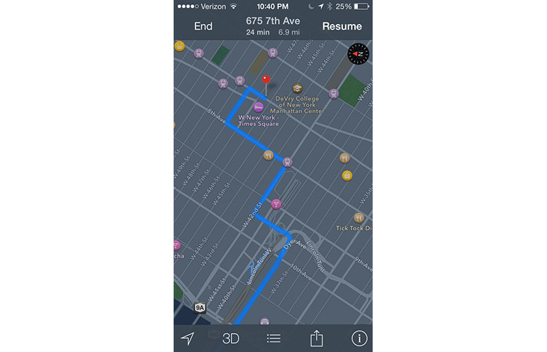
Click to EnlargeA night mode, which is automatically activated when you're navigating after dark, turns the normally beige and buildings and streets to darker shades of gray. It's a lot less distracting when everything else around you is dark.
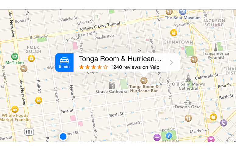
Yelp info is also integrated into Maps; tap on one of the pins, and a tag appears, showing the distance in time to that location, as well as its Yelp rating, and the number of reviews. Press the caret on the right, and you get additional Yelp information, such as contact information, reviews, photos and hours of operation.
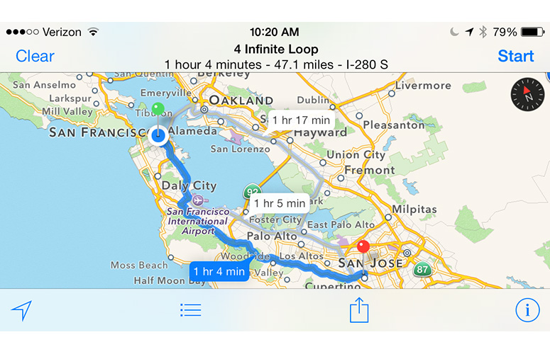
Click to EnlargeUnfortunately, Apple still doesn't offer public transit directions. The Maps app merely suggests public transit apps in the iTunes store. We're hoping Apple makes good on its acquisition of Hopstop soon.
When we performed a Siri search for "directions to Yankee Stadium," Maps smartly started the route at our current location. You'd think this was an obvious starting point, but earlier versions of the Maps app would assume our starting location was miles away from where we actually were.
Maps also integrates with the Calendar app, as well as OS X Mavericks. If it detects an address in a calendar appointment, you can press it to open it in Maps.
App Store
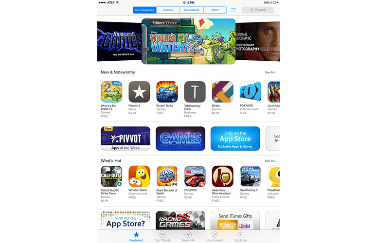
Click to EnlargeWhile the look of the App Store remains largely the same, its organization is changed. Along the top are four tabs (All Categories, Games, Newsstand and More), along with a drop-down menu for your Wish list, and a Search bar. (On the iPhone, the three options at the top are Categories, Featured and Wish List).
In addition to Featured, Top Charts, Search and Updates, there is now a "Near Me" category at the bottom that shows what apps are popular near your location. We're still trying to figure out why we'd be interested in what apps those around us have.
If you select an app in the store to view its details, the Share icon appears in the upper right corner. In addition to sharing a link via AirDrop, instant message, email, Twitter or Facebook, you can also add it to your Wish List or gift it to someone.
MORE: Best Apps 2013
iTunes Store
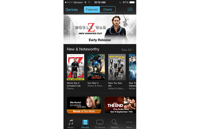
Click to EnlargeLike the App Store, Apple made a few tweaks to iTunes to incorporate new features. On the iPad, menu options at the top of the screen are All Genres, Pop, Rock and More (Hip-Hop/Rap is added in landscape mode). In between these tabs and the search bar is a drop-down menu that displays your Wish List, iTunes Radio history (with the option to purchase each song), and Previews (which shows what songs you previewed). Along the bottom are categories for Music, Movies, TV Shows, Audiobooks, Top Charts, Genius and Purchased.
By necessity, menu options on the iPhone are more limited: along the top are Genres, Featured, Charts and the drop-down for Wish List, Radio and Previews. At the bottom is Music, Movies, TV Shows, Search and More.
Regardless of the platform, the Music and Audiobooks pages have white backgrounds, while Movies and TV shows have a dark gray background. It's a simple visual cue that helps differentiate audio from video content.
Game Center
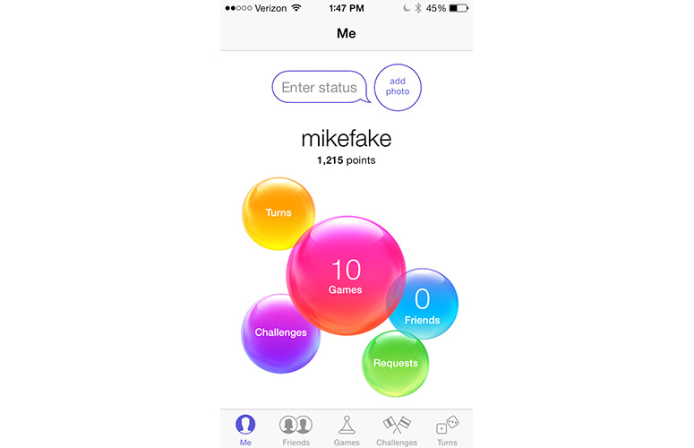
Click to EnlargeThe green felt is gone. Game Center no longer looks like a poker table. Instead, it looks like a kid's birthday party. The white screen is dominated by five large colored balloons that float in the middle of the page. The largest of these is a red balloon in the center, which shows how many apps you own. To the left is a yellow balloon for Turns, and a purple balloon for challenges. On the right is a blue balloon showing how many friends you have, and a smaller green balloon shows game requests.
Along the bottom is a list of popular games, and below that are menu items that replicate the balloons' functions. It's odd to see this kind of redundancy from Apple.
Voice Memos
Gone from Voice Memos is the old-school microphone and decibel meter, replaced with a stark black and white interface that may not look as fun, but is more functional. The red Record button is now much larger, and instead of a somewhat vague button on the right, you press the plain-as-day "Done" when you're finished recording.
When you start a recording, the volume of what you're recording is shown along a timeline, and the amount of time elapsed is also displayed in large numbers.
Compass
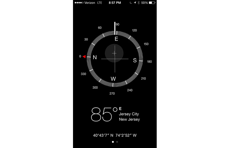
Click to EnlargeThe Compass app on iOS 7 is definitely minimalist. Instead of something that looks like it belongs on the H.M.S Pinafore, the new Compass app is a simply white-on-black affair. Apple added an extra feature to this app; swipe to the left and the compass becomes a level. It's about as minimalist as you can get. Held perpendicular to the ground, the top half of the screen is white, the bottom half black, and the measurement is shown in the middle. Tilt your phone, and the white and black sections adjust to show the angle. Lay your phone flat, and it becomes a bubble level, with two white circles on a black background. If you get everything level, the black part turns green.
Verdict
Click to EnlargeThere's no question that iOS 7 is a satisfying upgrade for iPhone, iPad and iPod touch owners. The flattened interface feels fresh, clean and well organized, even though some of the aesthetic changes are jarring at first. By comparison, if you pick up an Android phone, such as the LG G2 or Galaxy S4, the screen feels cluttered by comparison. iOS 7 is more streamlined and unified.
However, in a reverse of when iOS debuted, Apple is now the company playing catch-up in terms of features. Enhancements such as Control Center, card-like multitasking, camera filters and streaming audio have all been done before, and in some cases, better. At the same time, Android phone makers continue to out-innovate Apple in other ways. For instance, you can wake up the Moto X with your voice and go straight to Google Now. Not so with Siri. And on the S4, G2 and HTC One you can erase photobombers from pictures.
We're not advocating the kitchen-sink approach taken by Samsung, LG and others, but Apple needs to invent and incorporate industry-leading features into the next version of its mobile operating system. Ultimately, iOS 7 won't persuade anyone to switch from Android, but it is a welcome upgrade for anyone running iOS 6 on their iDevice of choice.
- Top 10 Smartphones
- Smartphone Buyers' Guide 2013: 7 Things You Need to Know
- How to Use iOS 7: Tips, Tricks and Tutorials
iOS 7 Specs
| Company Website | http://www.apple.com |
| Platforms | iOS |
| Software Type | Operating Systems |
Michael was the Reviews Editor at Laptop Mag. During his tenure at Laptop Mag, Michael reviewed some of the best laptops at the time, including notebooks from brands like Acer, Apple, Dell, Lenovo, and Asus. He wrote in-depth, hands-on guides about laptops that defined the world of tech, but he also stepped outside of the laptop world to talk about phones and wearables. He is now the U.S. Editor-in-Chief at our sister site Tom's Guide, where he oversees all evergreen content and the Homes, Smart Home, and Fitness/Wearables categories for the site..
