7 Ways to Make Windows 7 More Touch-Friendly
Sign up to receive The Snapshot, a free special dispatch from Laptop Mag, in your inbox.
You are now subscribed
Your newsletter sign-up was successful
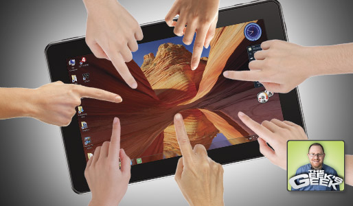
As someone who believes in open platforms and user choice, I want Windows 7 to compete in the tablet space. After all, there are millions of applications that run under Microsoft’s desktop OS and there’s no app store gate keeper to stop anyone from writing and distributing software. Unfortunately, as I (and others) have seen on a number of tablets lately, the Windows 7 UI just doesn’t work well with finger input. On the bright side, we hear that Microsoft is working on a more touch-friendly interface for Windows, which is supposed to be based on the “big buttons” of Media Center.
Microsoft will only get this right if, instead of trying to re-invent Windows as a new-fangled mobile OS like Windows Phone 7 or Android, it works to make as many desktop applications as possible touch-friendly, whether those apps were written for touch or not. The particular problems Microsoft needs to focus on are so small you’d think they would have done this already. In fact, several third parties have tried to deal with these issues by offering their own shells and utilities, but these often fall flat because they aren’t built into the operating system.
If Steve Ballmer and company want some unsolicited advice, here are seven simple ways they could make Windows 7 touch-friendly.
- Redo The Virtual Keyboard: In Android, Windows Phone 7, or any other touch-friendly OS, the virtual keyboard appears the moment you focus on a text field. In Windows 7, however, a little icon of the touch keyboard pops-up and you have to tap that icon or drag the keyboard out of the side to make it appear. Once the keyboard appears, it covers part of the screen, quite possibly the text box you’re typing into. Instead, the keyboard should appear instantly at the bottom of your screen and force the rest of the content to squeeze in above it. Nothing should be covered by the keyboard window.
- Replace the Start Menu with Tabs: The Start Menu, with its small icons and variety of flyover menus, just doesn’t play well with touch. That’s why most OEMs bundle Windows 7 tablets with tab-based UIs. For example, the CTL 2goPad I reviewed last week had a third-party shell called EasyBits Quick. The problem with apps like EasyBits Quick is that they don’t contain shortcuts to all of your apps and they don’t get updated with new shortcuts as you install new software. The burden is on users to add and organize shortcuts for all the applications they install. Instead of forcing third-party solutions, Microsoft should give users the option of a full-screen, tab-based Start Menu.
- Offer a More Intuitive Right Click Motion: Right clicking to invoke context menus is a huge part of the Windows experience, but how do you right click when you’re using a finger? The default Windows 7 right click gesture is to press and hold, the same motion you’d want to use for dragging objects. The OS should take advantage of its native multitouch support by making right click a tap with two fingers.
- Space Out the Menus: Whether you’re pulling up a context menu via right click or pulling down a menu from one of your favorite programs, it’s simply too easy to tap the wrong option. You can blow the menus up by increasing their font size in Windows settings, but even then you might miss. Windows should automatically add padding to menu options.
- Forget the Tray: If targeting a menu option is difficult with just your finger, try tapping or right clicking on a tiny tray icon. Microsoft should continue to allow tray icons to alert you, but when you tap on the tray, you should get a graphical pop-up window with large icons for each of the tray items.
- Use Simple Ribbons: In the past few years, Microsoft has moved all of its applications and, through osmosis, many of its competitors’ programs onto the ribbon interface. In theory, this icon-heavy menu structure should be great for touch, but in practice, most of the icons are too small to target with an adult’s finger and are stacked on top of each other for added difficulty. Microsoft needs to come up with simplified ribbons for each of its programs, starting with Office 2010. These ribbons should use simple, large icons that are Duplo to the regular Office’s Lego sized icons.
- Offer a Window-Less Mode: The biggest problem with using Windows 7 for touch is the windows themselves. The close / minimize / maximize widgets are incredibly difficult to target, and resizing a window to a custom size is an exercise in frustration. Besides, on a 10 or 11-inch screen, one window at a time is probably plenty. Microsoft should offer a window-less mode where all windows are automatically displayed full screen, with only the taskbar left showing. Users can then employ the taskbar to switch between activities or close out.
In the event that some users still want windows on their tablets, Microsoft should make the widgets much larger and provide more space between them. They should also allow you to resize windows by dragging two corners at once.
I’m sure Microsoft will come out with something much more visually exciting and innovative than what I’ve suggested, but the bottom line is that they are just a few simple steps away from having something really strong. The real key is that they hurry up and get the improvements out there, because every day they’re losing ground as users struggle with an operating system that supports touch but wasn’t made for it.
Online Editorial Director Avram Piltch oversees the production and infrastructure of LAPTOP’s web site. With a reputation as the staff’s biggest geek, he has also helped develop a number of LAPTOP’s custom tests, including the LAPTOP Battery Test. Catch the Geek’s Geek column here every other week or follow Avram on twitter.
Sign up to receive The Snapshot, a free special dispatch from Laptop Mag, in your inbox.


