Google spent the last few years fixing up Android’s nuts and bolts to transform it into a more mature mobile OS. That meant fewer cosmetic changes and an increased focus on addressing Android’s core shortcomings, such as fragmentation and security.
For Android 12, however, Google has a different agenda: to compress all those years of work into a design that doesn’t feel like every inch is trying to do a million jobs.
- Best smartphones in 2021
- Phones with the best battery life in 2021
With Android 12, Google’s mobile OS is getting a long-overdue facelift. In many ways, it’s a culmination of the dozens of foundational features Google has rolled out in the last couple of years. The redesign, called Material You, abandons the tense look Android has had so far, which featured impractically dense sections of menus and options, and spins them into a more approachable and playful interface.
A more personal Android
Google is building upon what always set Android apart from other mobile operating systems: personalization. With Material You, users can customize their software’s theme however they want. Fonts, buttons, and nearly every other element of Android have been stretched to boldly reflect the theme users pick for themselves.
Android 12’s first beta is now available for a handful of phones, and while it doesn’t house all of the update’s most important features, it offers a glimpse into Google’s redirection with Android.
Android 12’s most striking feature is its playful and expressive nature. Unlike Android 7’s paper stack-like system, Android 12 elements feel more alive with richer animations, more color, and larger footprints.

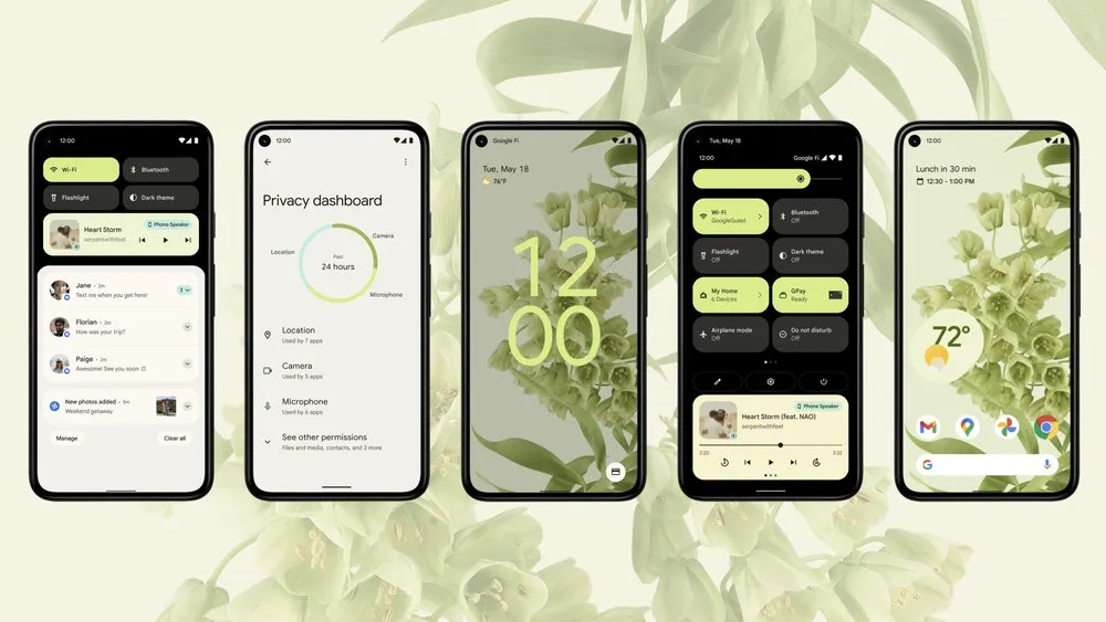
For instance, the brightness and volume bars are no longer just a straight line with a cogwheel-like handle on top; they have a themed trail that clearly tells you their current status. Quick Settings, instead of a grid of circles, takes up more of your screen and lives in a separate dashboard-esque area where you can easily toggle and find the setting you’re looking for. Similarly, individual notifications have accented bubbles of their own; they no longer feel cramped in a tight space.
It’s easy to find instances of Google’s new design approach throughout the latest Android beta, and that’s telling. On previous overhauls, Google generally took its time to revamp the various Android elements to match the latest design language. Android 12’s Material You offers a sense of confidence and reassuring consistency. When I tap an element, I know how it’s going to react, which isn’t something I can usually say with Android’s previous updates.

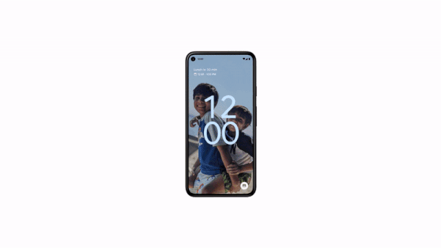
The coat of Material You also breathed refreshing air into sections I wouldn’t normally think twice about. The clock on the lock screen is huge and its size automatically shrinks into a corner if you have any pending notifications. When you plug an Android 12 phone in, it sends a wave of colors across the screen. The settings menu tackles its overwhelmingly cluttered layout with cleaner fonts and icons.
Once Google rolls out all of the Material You updates it showcased at I/O, more of Android’s interface, including widgets, will automatically adapt to your wallpaper’s color palette.
Although Android 12 displays less content in one go, I don’t mind these larger elements. Previously, Google crammed in so many buttons and toggles in a single space that you had to accurately tap the right pixel in order to access what you wanted. So Material You’s spacious areas are welcome alterations.
Clever animations that don’t get in your way
One of the pet peeves I’ve had with Android over the years is that the animations, especially compared to iOS, are too jarring and unpleasant. Android 12 fixes that with smoother transitions. They are well placed and subtle enough to not slow you down. When you can’t scroll any further on a page, for example, everything on the screen will stretch a little to let you know of it.
Playing catch up with Apple’s privacy suite
With this update, Google continues to expand Android’s growing slate of privacy tools, and I’m not even complaining about the fact that most of it, this time, is borrowed from iOS.
The centerpiece of Android 12’s privacy additions is a menu called the Privacy Dashboard. Here, you’ll find the majority of tools you’ll need to secure your Android experience. You can check which apps last tapped into your data and cut off their access directly from the Privacy Dashboard.

Like iOS, Android now also pins indicators at the top of the screen whenever an app is using your phone’s camera or microphone. On top of that, you now have the option to feed apps approximate location data. For example, let’s say you installed a new weather app. You don’t need to tell it exactly where you are. Instead, your Android phone can just punch in your locality.
More importantly, though, Android 12’s software houses a new section called the “Private Compute Core.” This is sort of an isolated space that Google says can’t literally connect to the internet, eliminating the possibility of it ever compromising or covertly sharing your data. Here, Android 12 will run a handful of AI-enabled functions that involve your sensitive data like Smart Reply (which requires reading all your incoming and outgoing texts) to make sure they don’t ever leave your phone.
Most of these new privacy options are not yet available, so it’s hard to tell how effective they will be. A lot of developers still haven’t updated their apps for the security tools Google released last year like one-time permissions and I often face abrupt crashes due to that. Therefore, while Android’s privacy offerings have come a long way, I hope Google is stricter this time in imposing them over third-party devs.
Outlook
Android 12 is shaping up to be one of the most significant updates Google has ever introduced, and I’m glad to report it doesn’t feel out of place. Despite what you may think at first glance, the playful design isn’t a novelty that wears off in a day or two. It makes sense and Google managed to do it all without compromising on function. Hopefully, third-party developers will soon get on board and update their apps. But even without that, I’m looking forward to trying out the remaining aspects of Material You in the upcoming beta releases.