Laptop Mag Verdict
Microsoft's Windows 8.1 Update makes the company's OS more mouse-friendly and intuitive to use, but it still buries important info.
Pros
- +
Easier to see which apps are open, switch among them
- +
Able to close modern apps with a single click
- +
Power button now on Start screen
Cons
- -
Still no Start menu
- -
No way to make new taskbar, window bars persistent
- -
Battery, Wi-Fi status still missing
Why you can trust Laptop Mag
When it launched Windows 8 in 2012, Microsoft radically changed the interface of its OS, providing a better touch experience but alienating millions of keyboard and mouse-centric users. Last year, the company made some major improvements with Windows 8.1, bringing back the Start button (but no Start menu) and including a new multi-window mode for its "modern" interface. Now, the company is releasing an update to Windows 8.1 that adds a few more mouse-friendly features. Are these changes enough to make Windows 7 diehards feel comfortable about upgrading?
Update Process
If you already have Windows 8.1 installed and haven't turned off automatic updates, your PC will install the new update without any intervention from you. However, if you still haven't updated from Windows 8 to 8.1, you'll need to do so beforehand.
MORE: Best Windows 8.1 Browser: Chrome vs. Firefox vs. Internet Explorer
Default Settings Changes
Click to EnlargeIf the Windows 8.1 update detects that you have a laptop or a desktop (a status the program determines using information entered by your PC's manufacturer), it changes a couple of default settings to make your UI more mouse-friendly. However, if users had already configured these options on their own, the update will not alter their preferences.
In a radical change, the new update configures your computer to boot directly to desktop mode, so mouse-centric users don't have to navigate through the Start screen to get to their preferred interface. While this change is convenient, it has been available as a built-in option since Windows 8.1 launched and through free, third-party utilities in Windows 8.
Sign up to receive The Snapshot, a free special dispatch from Laptop Mag, in your inbox.
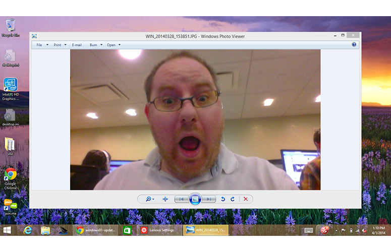
The update also changes the file associations for photos, music and video files so that they open in Windows Photo Viewer and Windows Media Player -- both desktop apps -- rather than in their Modern UI equivalents. This change makes it less jarring when you double click on a JPG, MP3 or movie file from Windows Explorer.
Persistent Taskbar with Pinned Modern Apps
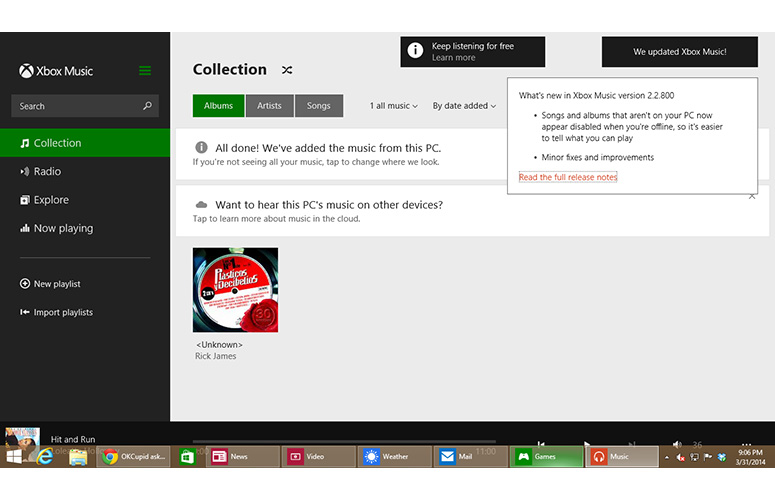
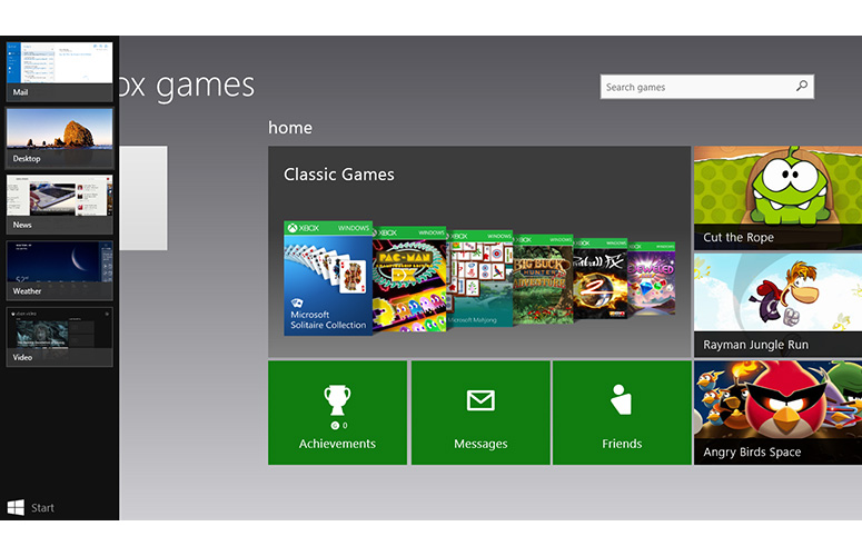
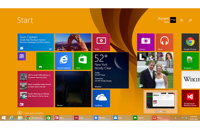
Click to EnlargeOne of the biggest problems with Windows 8 and 8.1 is how separate the task lists seem; the desktop taskbar shows only desktop apps, and the Modern UI task menu shows only Windows Store (aka Modern) apps, with the desktop shown as one icon. While Microsoft has done nothing to change the Modern UI task menu, the taskbar now shows icons for all open apps, whether they are desktop or Windows Store programs.
We particularly appreciated finding all of our programs in one place and seeing preview thumbnails of any open Windows Store apps when we hovered over their taskbar icons, just as we would for desktop apps. When we clicked the icon for an open app, the animation that makes it look like the app is rising from the taskbar was the same whether we were switching to a desktop or Windows Store app. However, Windows Store apps always opened full screen. Clicking the taskbar icon for the current Windows Store app caused it to minimize, just as a desktop app would under the same circumstances.
MORE: Top 25 Windows 8 Apps
Click to EnlargeYou can also pin the shortcuts for Windows Store apps to the taskbar, just as you would for desktop apps. In order to drive more desktop users to Microsoft's app library, the Windows Store itself gets pinned to the taskbar as soon as you complete the update.
Seeing all your open and pinned apps in one place is of little use, however, if that place disappears when you change from desktop mode to Modern UI. Fortunately, Microsoft has recognized the importance of the taskbar by making it visible from within the Modern UI, as long as you pull your mouse pointer down below the bottom of the screen.
Too bad there's no way to make the taskbar stay on the screen at all times. In order to unhide the taskbar, we had to move our pointer well into the invisible space below the bottom of the screen and hold it there for at least half a second. The bar also disappeared in less than a second after we moved our pointer away from it. We wish Microsoft provided the option to keep the taskbar on screen instead of forcing users to constantly hide and un-hide it.
Window Bar for Modern Apps
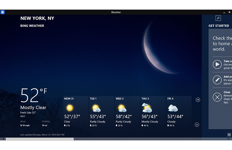
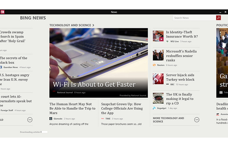
Click to EnlargeMicrosoft added another key UI element that's hidden until you hover in the right spot with your mouse. All Windows Store apps now have window bars, complete with the app title in the middle, an icon in the right corner and minimize/close buttons in the left corner. The close button provides a huge advantage, not only for less-experienced users who did not realize you can close a Windows Store app by dragging it down and off screen, but also for anyone who just wants to terminate a program with a single click. The minimize button takes you back to desktop mode while leaving the Windows Store app open in the background.
Unfortunately, the title bar only appears for about two seconds when you open or switch to an app, and only reappears if you hover over the top of the screen. While experienced users will know they can make this bar reappear by hovering, the users who need it most may not catch on. As with the taskbar, Microsoft offers no way to keep the window bar on the screen at all times.
MORE: How to Encrypt Files on Windows
Hover Corner Delay
Click to EnlargeMicrosoft kept the hover function that shows the charms menu when you place your pointer in the upper right corner of the screen or the most recent app when you place the pointer in the upper left. However, the company told us some users feel that these objects appeared too abruptly and distracted them when they were trying to click buttons or close windows. The Windows 8.1 update increases the delay slightly before these menus appear.
In our testing, this delay seemed short but adequate, though it was difficult to see any change after we installed the update. Those who don't like these "hot corners" have the option to disable them in the properties menu, a choice that was available before the update.
Power and Search Buttons
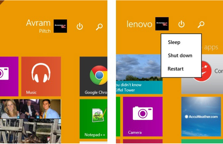
Click to EnlargeBecause so many users had a hard time finding the power button and the charm for searching in earlier versions of the OS, Microsoft has put small versions of these buttons next to the user profile icon on the Start screen.
We found the new power-button placement particularly compelling, because it allowed us to restart or turn off our computer directly from the Start screen. However, we wish the button allowed us to shut down with just one click rather than launching a context menu. This meant we had to click a second time to choose whether we wanted to shutdown, restart or sleep. Windows 7 provides both a single-click shutdown button and a menu for choosing the other options.
New Start Screen Context Menu
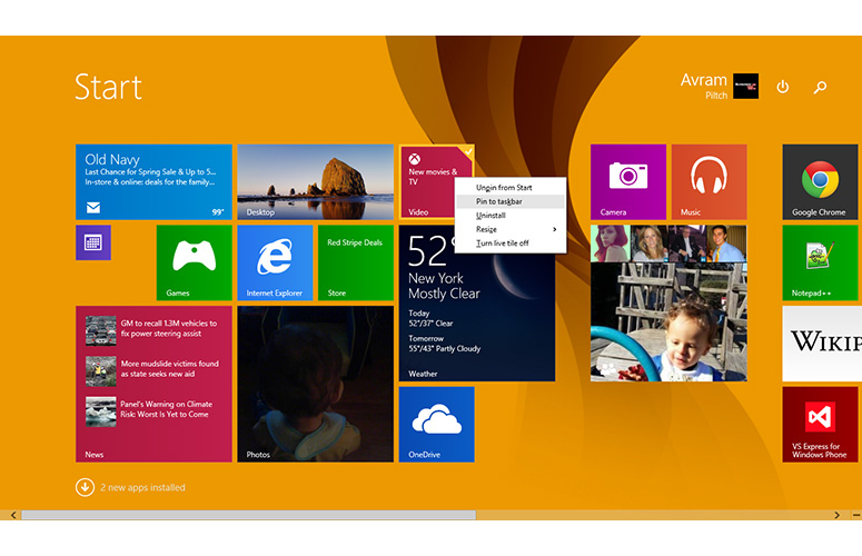
Click to EnlargeAnother Start Screen improvement involves the context menu you get when you right click on a tile. In Windows 8 and 8.1, right clicking on a tile launched the app bar on the bottom of the screen with a series of options, including changing the tile size, making it a live/not live or uninstalling it. After the update, those options now appear in a gray context menu that shows up right next to where you clicked. This saves a few pixels of scrolling so you don't have to go to the bottom of the screen to choose a tile option. However, if you perform this action on a touch screen, you will still get the app bar.
MORE: Windows 9 Rumors: New Start Menu, Apps on Desktop, More
Finding New Apps
In Windows 8, the OS automatically added newly installed apps to the Start screen, but apparently Microsoft felt that this created too much clutter. As of Windows 8.1, apps only appear on the Start screen if you pin them there yourself.
However, to make your newly installed apps easier to find from Start, the Windows 8.1 Update shows a message next to the "all apps" down arrow button, which says how many new apps you've installed.
When we installed one desktop app and two Windows store apps, the message next to the down arrow said, "3 new apps installed." When we clicked the arrow, it transported us to the All Apps list, where each of our new apps had a "new" graphic next to its listing. While we appreciated being able to locate our new apps more easily, we wish that they were added to the Start screen, just as new apps were always added to the Start menu in Windows 7, Vista and XP.
Features Still Missing
While Microsoft has made a nice step forward with the Windows 8.1 update, the operating system still lacks many key features that both tablet and desktop users would want. The operating system is still missing a bona fide Start menu, as the Start button takes you back to the tile-based Start screen.
While this behavior is consistent with Microsoft's vision of the Start screen as the central hub of the user experience, it's still jarring and annoying for users who live on the desktop. In Windows 7 and earlier systems, the Start Menu appears as an overlay on top of the desktop, allowing you to launch an app or find a file without losing the visual context of your other work. Fortunately, you still have the option of installing a third-party Start menu replacement such as the free Classic Shell or, our favorite, the $4.99 Start8.
Though the addition of title bars makes Windows Store apps feel a little bit more like their desktop counterparts, there's still no way to run these new apps in resizable windows, nor is there a way to run desktop apps in touch-friendly Modern UI. Stardock's $4.99 ModernMix allows you to run Modern apps on the desktop, a feature that Microsoft should have built into the operating system itself.
MORE: 8 Worst Windows 8 Annoyances and How to Fix Them
Within Modern UI, Windows 8.1 still buries a number of key pieces of information that other touch platforms put front and center. If you want to see the battery level, Wi-Fi status or clock, you must still open the charms menu to see a temporary overlay of this vital information. Even with the overlay, you only get an icon for the battery and not a precise percentage.
Lastly, though the task bar now contains icons for both desktop and Windows Store apps, the Modern UI task menu still treats the entire desktop as just one app, represented by one icon.
Verdict
Click to EnlargeUsers who are not familiar with Windows 8.1 or who just dislike the Modern UI will appreciate new features that make closing apps, turning off the PC, or switching between desktop and Windows Store apps a little easier. However, the Windows 8.1 UI still makes you switch screens and navigate to hidden menus to perform tasks that prior versions of the operating system placed front and center. In fact, the two biggest improvements in this update -- the taskbar and window bar -- both hide themselves in Modern UI. If you are concerned about upgrading from Windows 7 or purchasing a new PC with Windows 8.1, these improvements won't be enough to change your mind. But they will make your life a little easier if you decide to take the plunge.
Windows 8.1 Update Specs
| Company Website | http://www.microsoft.com/ |
| Platforms | Windows Phone 8 |
| Software Type | Operating Systems |

