Windows 8 Consumer Preview Hands-on: What We Like, What We Don't
Sign up to receive The Snapshot, a free special dispatch from Laptop Mag, in your inbox.
You are now subscribed
Your newsletter sign-up was successful
Are consumers ready for a radically different kind of Windows? Microsoft has reached an important milestone with the release of the Windows 8 Consumer Preview. Now that developers have had a crack at the OS to start creating apps, it's time for Microsoft to get its bold new software into the hands of users to share their feedback — and to see if the world wants one platform for both tablet and desktop computing.
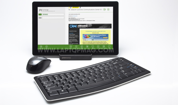
Though it continues to borrow heavily from Windows Phone, the Consumer Preview includes lots of interface tweaks, a bevy of new apps (mostly homegrown) and new cloud and Web- browsing features that make Windows 8 feel more well-rounded heading into the final launch later this year. To test the latest version of Windows 8, Microsoft provided us with a Samsung Series 7 Slate PC with the Consumer Preview pre-loaded, along with a Bluetooth keyboard and USB mouse.
Join us for a tour of the Windows 8 Consumer Preview to find out what's new, what works and what's lacking.
Windows Account Gets You Started—and Synced
Windows 8 will try to make it easy as possible to set up your PC, because all you need is a Microsoft account. Formerly known as Windows Live ID, a Microsoft account is used to log into accounts on a Windows 8 PC. Even better, if you’ve set up a Windows Phone previously, all of the other accounts you’ve set up under that device will travel with you. When we logged into our Windows 8 tablet, we found that the device had synced our Facebook, LinkedIn and Twitter accounts under the People app.
Plus, if you log into a second Windows 8 PC, all of your app settings and the overall environment goes with you. So, for example, if you have a specific background and organization to your apps on a work PC, they can migrate with you to a home computer. You can decide which settings you would like to sync in the PC settings menu.
Windows 8 Start Screen and Semantic Zoom
Sign up to receive The Snapshot, a free special dispatch from Laptop Mag, in your inbox.
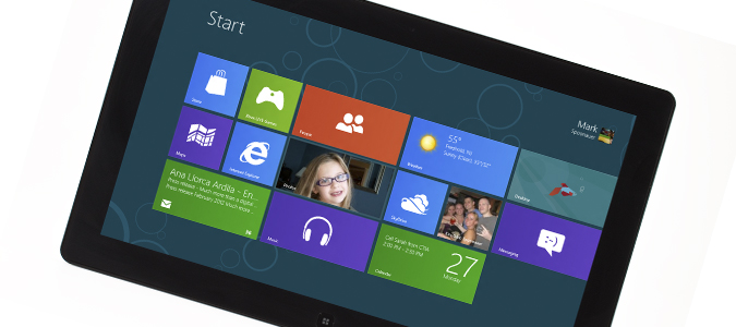
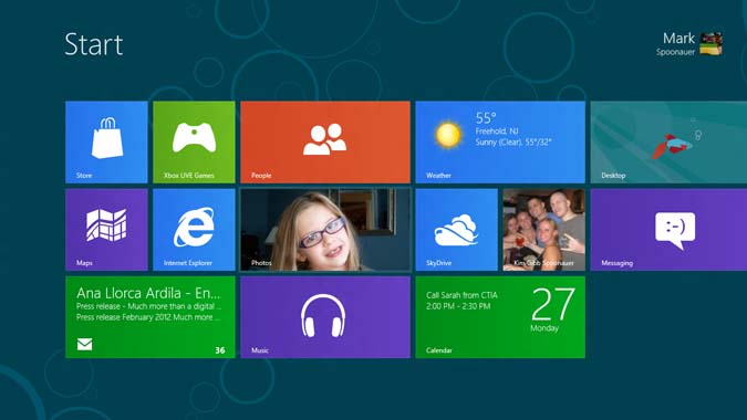
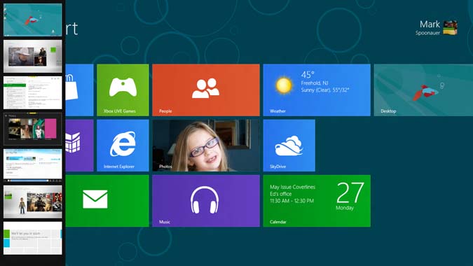
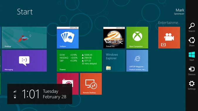
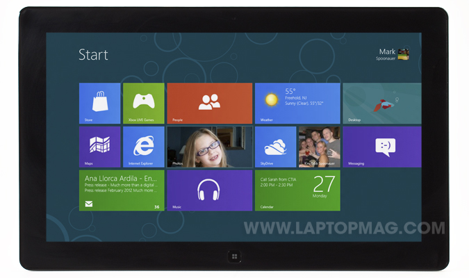
As we noted in our hands-on with the developer preview, Windows 8 looks nothing like Windows 7 and earlier versions of the OS — at least not on the surface. The Start screen uses a panoramic Metro-style, tile-based interface that's very similar to Windows Phone, allowing users to customize their tablet or PC to their heart's content. Unlike iOS, the tile-based UI of Windows 8 is inviting and engaging. It literally puts the personal in personal computing.
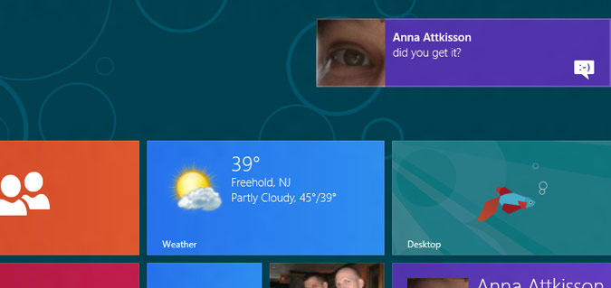
For example, in the Pictures app we could set a photo as the default image for the app tile. Other tiles display useful at-a-glance info, such as the number of new messages in Mail, the current and the latest temperature in Weather and a thumbnail of the album you last played in the Music app.
These features represent a critical difference between Windows 8 and iOS, which use static icons. Android approximates tiles with the way it handles widgets, but they're not as well integrated into the user experience.
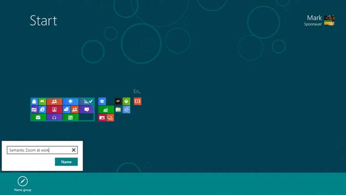
Where the Consumer Preview of Windows 8 goes further than the earlier developer build is that Semantic Zoom now works. This feature allows you to zoom out to see all of your tiles at once, making it easier to move tiles around. Once you've organized your apps the way you like, you can name a group of apps just by pulling down with your finger on a given block of tiles. Games or productivity would be two good examples.
Unfortunately, we found using the Semantic Zoom to be somewhat problematic because this view made everything appear too small.
Windows 8 Metro vs. Desktop
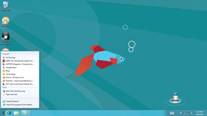
Microsoft likes to think of the Desktop in Windows 8 as just another app, but it's really much more than that. It's what allows you to run desktop applications in the classic Windows environment most users have come to know and trust. However, one key element is missing: the Start button.
Microsoft has eliminated the traditional Start button in favor of a touch-based Start button in the Charms menu you can pull up on the right side of the screen — just as you can in the Metro-style environment. If you're using a keyboard and mouse, however, there's a Start thumbnail that appears when you hover in the bottom left corner. Regardless, in both cases you're brought back to the Start screen, not shown a list of programs and other options.
This is a controversial move, as millions of people who use Windows 8 for the first time will wonder where the button went. Turning off your PC also just got harder. Before you just pressed Start, then Shut down. With Windows 8 you need to swipe from the right, tap settings, then tap Power, then Shut down. The good news is that in most cases users will want to just tap the power button to enter sleep mode.
The desktop includes a lot of other familiar features, such as Libraries for managing your files and the ability to pin applications to the taskbar. In our testing, touch accuracy when using desktop apps was better than with Windows 7 but still not as precise as Metro-style apps. We do like that you can run desktop apps and Metro-style apps side by side, thanks to the snap feature. We're just not sure Windows 8 needs both a desktop-style and Metro-style IE 10 web browser.
Keep in mind that only Windows 8 devices powered by X86 processors (Intel, AMD) will be able to run all desktop apps, while those devices powered by ARM processors will be limited mostly to Metro-style apps and Office 15. You'll also be able to access the desktop itself on ARM and the file explorer.
Touch Gesture Controls
Though the gestures don't take that long to master, getting around Windows 8 requires a learning curve. Swiping from left to right from the left edge of the display switches applications. The animation feels like you’re shuffling through a deck of cards — as if you were a dealer in Las Vegas. In other words, it’s very fast.
If you swipe from the left but then swipe back with a single motion, you’ll see a new view that displays up to seven thumbnails of open applications at once. This is a great addition, but we would prefer if this view were presented by default. When you have more than a couple of applications open, we don’t believe users will want to shuffle through them until they find the right one.
To close an app in touch mode, you drag it to the right and then to the bottom of the screen. This operation worked fine when flipping through apps but in the thumbnail view you need to press and hold the app and then pull it to the bottom of the screen to close it.
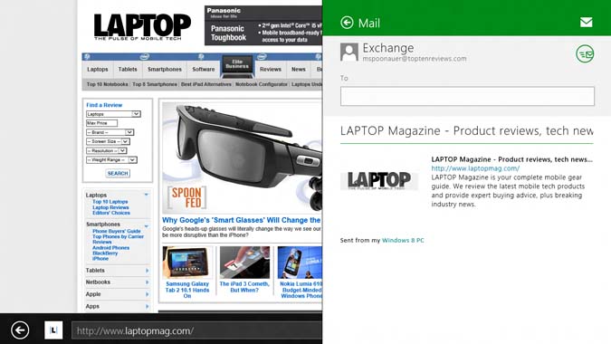
As with the developer preview build, you can use Windows 8’s snap feature to view two open applications side by side. When pulling an app on the screen you can then drag it to where you want it positioned. For example, you could view your inbox in one window while listening to music in another. Even better, Microsoft says it’s working with developers to optimize their apps so that they still provide plenty of functionality when they take up only a third of the display.
Swiping from the right edge of the screen to the left launches the redesigned Charms menu, which presents five options. You’ll see Search, Share, Start, Devices and Settings. We’ll get to what these options do in a bit.
Last but not least, swiping down or up from the top or the bottom of the screen shows you what options are available for a given app. For instance, in Calendar you’ll see three different view options along with Feedback, Today and New for adding an appointment.
When you add up all of these gestures, it’s clear that Microsoft has gone out of its way to make the interface as clean and focused on content as possible. The trade-off is that the user needs to put in effort out of the box to get the lay of the land.
Mouse and Keyboard Navigation
The good news is that Microsoft has obviously put a lot of thought into how Windows 8 should work with a keyboard and mouse. The bad news is that users will need to learn a separate way of navigating the OS. For example, to switch applications you first need to hover your mouse over the upper left corner, then left-click. And to display multiple open apps in the thumbnail view, you hover and then slide the cursor down.
Activating the Charms menu works in a similar way on Windows 8. You hover in the top right corner, then drag your mouse down. Microsoft made these decisions because it didn’t want users to inadvertently launch menus. In fact, you’ll notice that the Charms menu icons first show up in white without a background when you hover in the upper right corner, then transition to white-on-black when you move the cursor down. It’s a nice sort of visual confirmation.
Using Windows 8 with a mouse and keyboard has other benefits, the most important of which is the ability to start typing on the home screen to perform a search. Another perk for keyboard users: you can close any app just by pressing Alt+F4.
To see an app’s commands, just right click on your mouse. And to zoom in on content, you can use your mouse’s scroll wheel while pressing the Ctrl button.
So what’s missing? As this point we haven’t heard much about whether laptop touchpads will mirror what you can do with a touchscreen. After all, no one will want to hover with their touchpad in a corner when a two-finger or three-finger gesture would do the trick more quickly. Although Microsoft hasn’t yet released information on how touchpads will work with Windows 8, Synaptics told us it is working closely with Microsoft and PC makers to optimize the experience.
Touch Keyboard
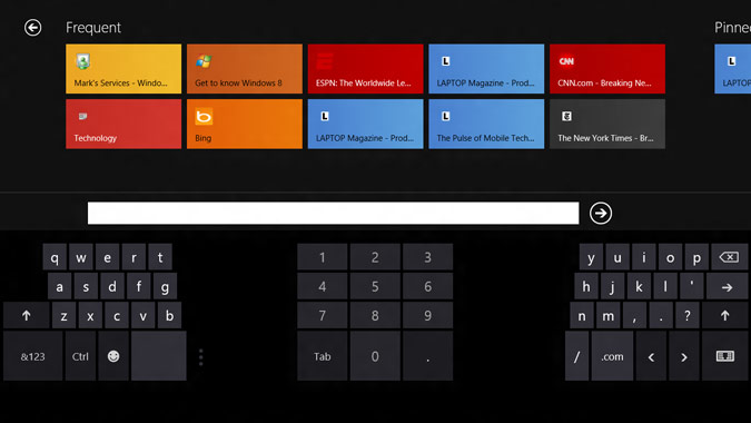
Windows 8 gives you a choice of keyboard types: a standard layout with large keys and a split layout, which has smaller keys that are easier to reach with your thumbs in landscape mode. The other benefit of using the split keyboard is that the number pad is always visible, though we don't see any reason why Microsoft couldn't add a number row to the standard layout, too, a la HP TouchPad.
The Windows 8 Consumer Preview includes the ability to resize the thumb keyboard. But this option is not easy to find. You need to press a vertical stack of three dots, then slide your finger to one of three options (Small, Medium, Large).
While we’re asking for improvements, Microsoft should make it so that the keyboard pops up automatically when performing certain actions, such as when conducting a search.
Charms and Sharing
Windows 8 focuses on sharing content with a dedicated Share option listed in the Charms menu. The best example of sharing in action is the browser. For example, when sharing an article from the Web, Windows 8 will automatically create a thumbnail image and link description to go along with the Web address. SkyDrive is another sharing option that will be available in the Consumer Preview. For now, Facebook and Twitter are not included but we hope that changes. (The developer preview of OS X Mountain Lion currently integrates with Twitter but not Facebook for sharing.)
The other Charms you'll see when you launch the menu are Search, Start, Devices and Settings. Search is contextually smart in that it knows what app you're using. For instance, if you're in Contacts and tap search your results will return only people in your address book. When you're on the Start screen, the Search option defaults to apps but you can then drill down into any number of other apps to conduct your search, whether it's Mail, Contacts or Video.
Microsoft Apps: People, Photos, Mail, and More
Although the Windows Store wasn’t yet open for business for third-party apps, Microsoft bundled several of its own Metro-style programs for the Consumer Preview. Here’s our quick impressions of each app.
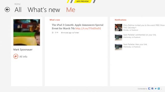
People: The People app should look familiar to anyone who has used a Windows Phone. Here you’ll see all of your contacts listed, which are pulled in from various sources. For now People syncs with Exchange, Google, Facebook, Twitter and LinkedIn, as well as Microsoft (formerly Windows Live).
Across the top you’ll see “What’s New” next to All contacts, which displays the latest social updates from your friends and followers. Next to What’s New is a Me tab, which shows your latest updates.
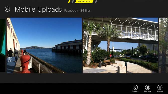
We like how People automatically links contact info across various networks into one entry. If that person is a Facebook friend, you can swipe to the right to see their photos. You can also send messages to contacts right from People and pin your favorite contacts to the start menu.
Too bad you can’t create groups of your favorite contacts in People as you can in Windows Phone — at least not yet.
Photos: Right now the Photo app is very much a work in progress. We could see only our own pictures (from Windows and Facebook) but not the latest images our friends uploaded, as you can with Windows Phones. Once you open a photo and swipe up or down on it, you can set it as the default image for the app tile on the Start screen, set it as your lock screen photo, or start a slide show. For now, though, you can’t share photos stored on Skydrive or Facebook.
Mail: While we expect Office 15 to be much more robust, the Mail app in the Windows 8 Consumer Preview has most of the basics covered. We added an Exchange account within a couple of minutes, and the two-column layout was easy to read. To switch accounts or to see your folder view, you swipe up from the bottom of the screen. Once in a message, the Mail app presents rich formatting options — including fonts and bulleted lists — as well as emoticons and attachment support.
Microsoft’s propensity to hide key features in Windows 8 rears its ugly head again here. Want to add an address to the bcc field? You’ll need to go to the bottom of the screen and tap More, then hit Show Bcc. There is absolutely no reason to hide this option, since it would easily fit in the left column. That needs to be fixed. You also won’t find a dedicated Search button; instead, you’re supposed to use the Search option in the Charms menu when you swipe from the right edge of the screen.
Messaging: In our testing, the Messaging was a bit of a dead end. Although our status said "Online" and we seemed to be signed into Windows and Facebook — and we could see our online contacts — our messages wouldn't send. We're assuming it was just a bug. When it works, Messaging will let you start a chat from the People app or directly from a contact you've pinned to the Start screen.
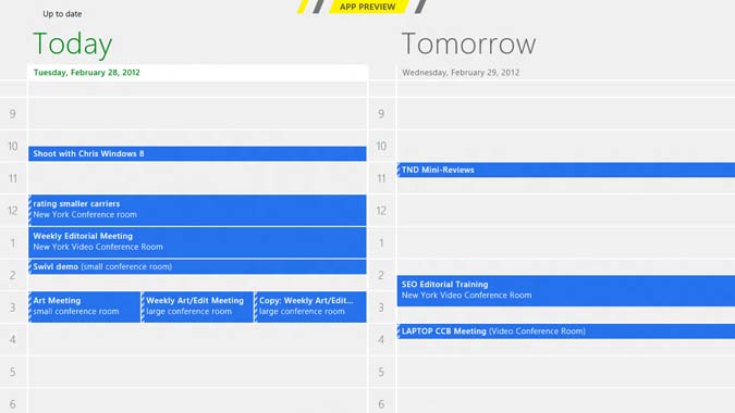
Calendar: The Calendar app in Windows 8 Consumer Preview is pretty straightforward, listing your appointments in a grid. The app syncs events from various accounts represented by different colors. For example, Exchange appointments were blue and Facebook’s were red. We found the most useful view to be Today, which showed events for today and tomorrow side by side. The Calendar tile on the home screen always lists your next appointment, as does the lock screen.
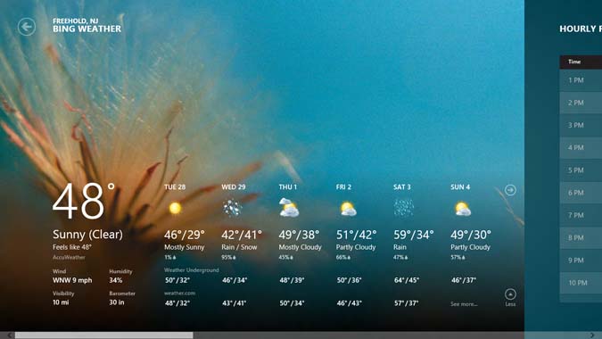
Weather and Stocks: The pre-loaded Weather app is pretty slick, presenting the 10-day forecast along with hourly conditions and various weather maps (radar, satellite, etc.). Our favorite feature is the historical weather panel, which shows the historical averages for temperature and precipitation.
Those looking to check the markets at a glance will appreciate the Finance app, which puts the Dow and other key indices front and center. Swiping to the right shows the big movers for individual stocks and the latest financial news.
Internet Explorer 10
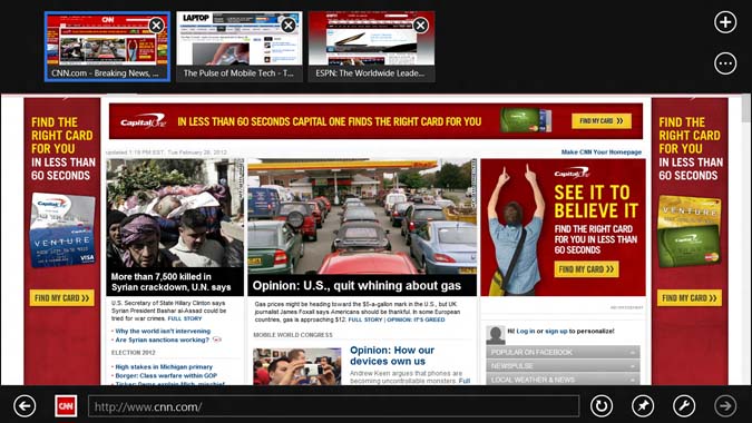
Microsoft's touch-friendly Web browser is growing on us over time, because it emphasizes speed and a full-screen view of your favorite sites. Pinch-to-zoom was smooth, as was double-tap to zoom. One of our favorite features is the ability to go back or forward just by swiping left and right, respectively, on the screen. However, you have to be careful not to swipe too close to the edge of the screen or you’ll accidentally switch apps or launch the Charms menu.
It's also a cinch to pin sites to your start screen as tiles. Microsoft says it's working with developers to enable additional functionality for sites to support Jump Lists to common tasks (such as posting a Facebook update) as well as deliver notifications directly to tiles.
IE 10 has two other noteworthy features. Clean Up Tabs lets you close all other tabs you have open other than the site you have open, And InPrivate browsing lets you surf without the browser storing history, cookies and other data.
Music and Video
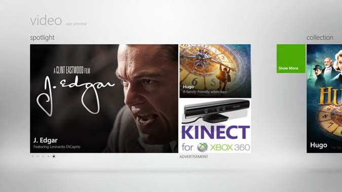
Bye, bye, Zune? Based on the Music and Video apps pre-loaded on our Windows 8 tablet, the Zune branding has been minimized but not eliminated. The Music app aggregates your collection along with links to Microsoft's music store via various promotions. The Video app works in a similar way, showcasing the latest titles available for download.
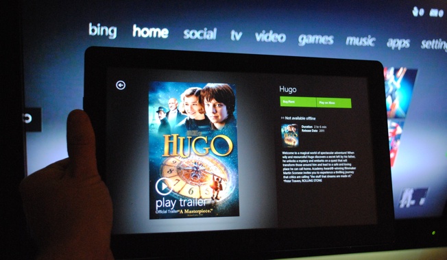
When we purchased "Hugo" it started streaming almost immediately. Purchasing Coldplay's latest album also went smoothly. Unfortunately, at least in the Consumer Preview build of Windows 8, Microsoft is forcing users to buy Microsoft Points to purchase content. It's time to kill the middle man.
Xbox Live Games and Xbox Companion
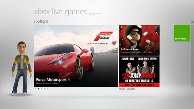
Another app very much under construction in Windows 8 is Xbox Live Games, which has a similar layout to the Music app. You'll see a Spotlight option promoting new titles, and scrolling to the right displays your collection, as well as links to the Windows and Xbox game marketplaces. As with Windows Phone, you have the option of personalizing your own avatar, adding to the fun.
Microsoft bundled a couple of games with the Consumer Preview: Solitaire is a decent time-waster with fluid touch controls, while Pinball FX has much richer graphics but very rudimentary game play. We'll be excited to see what developers can pull off.
Want to connect your Windows 8 PC to you Xbox? You can with the Xbox Companion app, which allows you to stream videos you've purchased to your TV. In our testing, though, the streaming was choppy and pixelated, and then we encountered a network error. At least for now, AirPlay this is not.
You can also use your Winodws 8 tablet to remotely control your Xbox; in this mode the touchscreen doubles as a remote with the B, X and Y buttons lining the bottom of the display. If you have a game pre-installed on the console, you can launch it from your slate.
SkyDrive
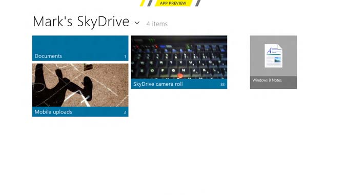
SkyDrive is more than just an app in Windows 8; this cloud-storage service is integrated into the operating system. For example, you can send documents or files stored on SkyDrive through the Mail app. And Microsoft is enabling developers to leverage SkyDrive for their own apps, so long as they support opening and saving documents and photos.
The SkyDrive app itself presents the files you've uploaded in a grid-based interface. Microsoft is also releasing a SkyDrive app for the desktop, which will work with Windows 8 but also Windows 7 and Vista. SkyDrive could make it pretty easy to migrate your files to a new PC via the cloud.
Windows Store and Third-Party Apps
Microsoft has just opened the Windows Store and we like what we see so far. Since finding good apps to download is a challenge on every platform, Windows 8 emphasizes ease of discovery in the Windows Store. In addition to top app lists, you'll be able to browse by categories and see Editors' choices highlighted on a weekly basis. For now, the Windows 8 Consumer Preview will concentrate on free downloads, but users will eventually be able to purchase apps and try before they buy.
The shopping experience is very fluid and the store's tile-based interface looks sleek, but we don't like that you need to keep on scrolling to see all of the available categories. The apps themselves look great so far, and mirror the panoramic Metro-style UI of the Start Screen. The USA Today app presents headlines and videos in an elegant grid with the current weather conditions in the top right corner. We also like the slick Slacker app, which lets you control audio playback while using other apps via a small panel in the upper left corner.
Verdict
The Windows 8 Consumer Preview is far from a finished product, but if we had to sum up the experience at this stage we'd use two words: Pretty. Complicated. Just as with Windows Phone, Windows 8’s tile interface is engaging and inviting, and we like how easy it is to personalize the Start screen. While they’re in the beta form, the pre-loaded Metro-style apps go a long way toward demonstrating the potential of Microsoft’s OS and how apps can work together with the help of services such as SkyDrive.
With the exception of expected bugs, Windows 8 performs smoothly at this stage and responds well to touch. Microsoft also deserves credit for making the OS work well with a mouse and keyboard, although we’d like to notebook makers mirror touchscreen gestures with touchpads.
At the same time, Windows 8’s interface takes minimalism to the extreme, hiding options that take too many taps to surface. In addition, because you need to swipe from three sides of the screen to navigate, at times using the OS feels like work.
As for the supposed schism between tablet and desktop computing, Windows 8 does a fairly good job of bridging the gap with features like Snap, but there’s no denying that they’re vastly different computing environments, complete with two separate IE 10 browsers. Some will just prefer to keep their PC and tablet separate, as Apple is doing with iOS and OS X Mountain Lion.
We'd say there’s a very good chance that users will embrace the next Windows despite the extreme makeover. But the hardware and apps will have to be enticing enough to justify the learning curve. Based on what we've seen in the Windows Store thus far, Microsoft is off to a good start.

